Clicks and Eyeballs Are Not Enough: Content Interactions Turn New Users into Customers
7 min read
You probably spend a good deal of time thinking about how to attract people to your site or app. But once they click through and their eyeballs are finally on your product, how much thought have you given to what happens next?
Getting people to your site or app is only the beginning.
Driving traffic to your site or app can feel like a battle. You agonize over search engine rankings, marketing messages, paid ad placements, and all the SEO/SEM mojo it takes to get a sales funnel going online. This makes sense. You want to lead people to your business or service. As a result, when we talk about content online, we talk a lot about clicks and eyeballs.
When your hard work pays off and a potential lead, client, partner, etc. arrives at your site or app, you may think, “Victory!” But the truth is, at the moment you’re ready to throw the confetti, your user’s journey with your site or app has only just begun. And if you haven’t given them a clear path to continue, they may leave as immediately as they’ve arrived.
Users rely on content interactions.
Your site or app, no matter how simple or complex, contains actions that your users must interact with to do business with you: search, compare, navigate, pay – you get it. Each action is only as strong as the content that accompanies it. This accompanying content is short (you might even call it micro), but it is critical. Users rely on this combination of content and action, or content interaction, to know what’s happening and what to do next.
Characteristics of Strong Content Interactions
In the most user-friendly sites and apps, words for each content interaction have been carefully considered and selected to support users’ actions. These strong content interactions have these traits in common:
- Concise – Say what needs to be said in as few words as possible.
- Specific – Communicate the exact action the user needs to take.
- Contextual – Take into account what the user has already done and what they will do next.
- Consistent – Use the same words for the same action where it makes sense.
The Unfortunate Truth About Most Content Interactions
In most sites and apps, content interactions have not been considered at all. They have few or even zero of the traits listed above. This is, sadly, the norm. Your site or app very likely falls into this category. The confusion, frustration, or uncertainty that comes from ignoring your content interactions can lead directly to loss of potential customers. Not to mention the undoing of all your hard work to get their attention in the first place.
Use the five-second rule.
Don’t worry, this five-second rule is not about eating food that’s fallen on the floor. But it is about low-hanging fruit.
Once someone clicks through to your site or app, you have about five seconds to convince them that they should stick around. That’s mercilessly short. And much of their decision to stay or go depends on whether your content interactions are clearly answering their immediate questions.
Improving every single content interaction on your site or app right away is a lot of work all at once. For a less overwhelming start, put your focus on the content interactions your users care about in the first five seconds.
Three questions, five seconds.
In the first seconds after users arrive at your site or app, they subconsciously ask themselves three things:
- Am I in the right place?
- Do I see what I need?
- What do I do next?
If the answer to all three is “yes,” you have a good chance of them continuing to interact with you. If the answer to any is “no” or “not sure,” your chances of keeping them around diminishes significantly.
Fortunately, strong content interactions can answer all three of these questions in little more than a blink.
1) Am I in the right place?
You must instantly tell your users where they are and that they have arrived at the right place.
Turn your attention to these content interactions to clearly answer the question:
- Your Logo – Probably the single most powerful way to show that someone has indeed come to your business’ location online. However, if the logo doesn’t say your business name and is only a partial mark, it will be meaningless to your visitors as an answer to the question: “Am I in the right place?”
- Titles and First Lines – The screen title and very first line of text should prominently include keywords your users will recognize immediately as the ones they are looking for. This is particularly important if your logo doesn’t include keywords about what your business actually does.
2) Do I see what I need?
Once users are sure they are in the right place, they will wonder if you can help them. They need something from your site or app – does it appear to be there?
Ensure these two content interactions in particular are strong enough to show them the answer:
- Navigation – Visible navigation items with clear, concise labels are your best friend. Your users can see at a glance what your site or app contains, where they are in the structure, and whether they will be able to find what they need.
- Page Headings and Links – Your users are still rapidly scanning your page’s headings and links for words they recognize. They should immediately encounter prominent, intuitive words that support actions they need to take.
3) What do I do next?
You have convinced your visitors that they are in the right place and that your site or app offers what they are looking for. They are ready to take the next step to interact with you.
Don’t lose them here! Pay close attention to your content interactions:
- Prominent, Clear Action – The screen should tell your users exactly what they need to do to proceed. Do not assume they will figure it out for themselves. This action should be clearly named and the most important thing they could do next. This is their first step toward reaching that final page where they sign up, open an account, purchase something, call for a quote, etc. (Hint: This is NOT the place to direct them to “Our Story” or “About Us.”)
- Space to Take the Action – Resist the temptation to crowd other, less important actions around the one thing your user needs to do next. Give the most important next action space, clarity of words, and prominence. Save less important actions and information for further down the screen.
Let’s look at an example.
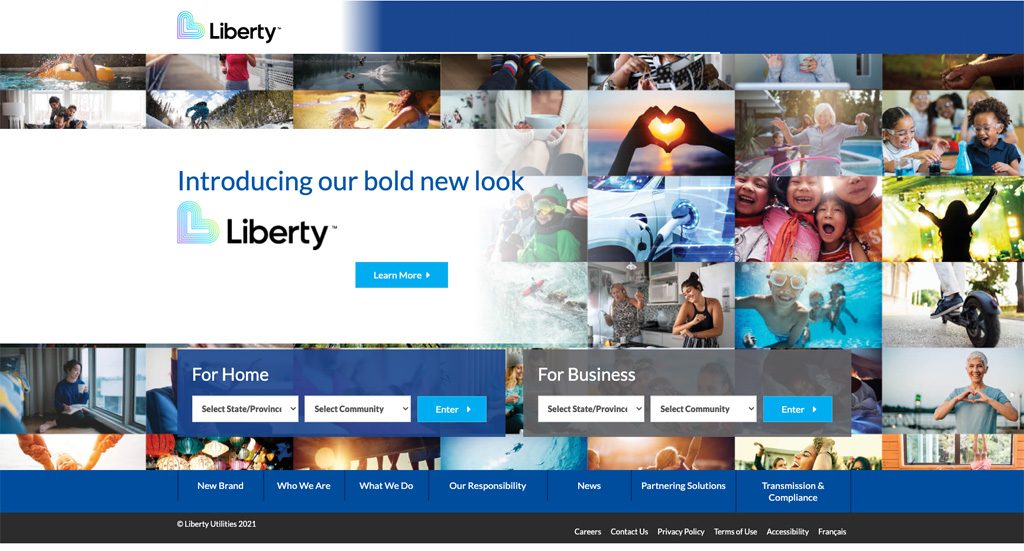
Liberty Utilities, below, offers up a mix of content interactions that support users well and also weak content interactions that need improvement.

1) Am I in the right place?
- Logo– The logo is present and obvious. However, this logo does not say what Liberty does so new arrivals will immediately be looking for prominent text that assures them they have the right Liberty and the right site.
- Titles and First Lines – The very first words say “Introducing our bold new look,” which does nothing to tell us what this site is about or whether we are in the right place. This screen doesn’t actually include the keyword “utilities” or “utility” anywhere except in tiny print next to the copyright. Without a strong content interaction that tells users what the company does and that they’re in the right spot, there’s a strong chance that many people will leave as soon as they arrive.
2) Do I see what I need?
- Page Headings and Links –"For Home” and “For Business” are strong content interactions that clearly allow users to select which one applies to them. “Enter” as the supporting text for the button in the search area, however, is a weak content interaction. It tells us nothing about what will happen next or how it will help us on the path forward. Even a simple change to “Go,” would make it more obvious that there is somewhere we will, in fact, go from here.
- Navigation – The navigation is visible, which is a good start (although the bottom of the screen is not ideal placement for a navigation bar).However, is there anything a user would need in this navigation bar? This navigation is 100% focused on Liberty’s internal concerns. There is nothing here that would tell a user that they will find what they need here.
3) What do I do next?
- Prominent, Clear Action – The first interaction on the page is “Learn More,” which is prominent, but completely generic, and still not about utilities. It doesn’t tell users anything about how to take their next action to get their task done. A strong content interaction here would include keywords about utilities and a specific action for users to take the next step to complete their task.
- Space to Take the Action – The main action, though a weak content interaction currently, is uncomplicated by competing actions or information.
Take the five-second rule to your own site or app.
If you do nothing else, using this five-second rule for every entry screen into your site or app will propel your users into the most important next step. You will see an immediate increased ability for your site or app to turn first-time users into new and happy customers.
Using Content Interactions as a Foundation to Success
Every single thing that users of your site or app do after they arrive is supported, however firmly or flimsily, by your content interactions. At its heart, improving your content interactions is about consistently making sure that your actions are accompanied by specific, concise, and actionable content.
Give it a try. You’ll be amazed at what the smallest words can do.


