Customization Lessons from an Experimental Art School Site
8 min read
Allowing users to customize your interface any way they please sounds like a great idea to many digital teams at first. You can’t make everyone happy, so why not let them choose their own colors, layout, favorites, and more? It sounds even more appealing when your clients or partners are creating a digital product for their own end users and branding comes into play.
But allowing too much customization of your interface elements can go downhill very quickly, negatively impacting the experience you were trying to make easier, more engaging, and better overall. Customization has its place. Its success will depend on what kind of balance you can strike between customization and usability.
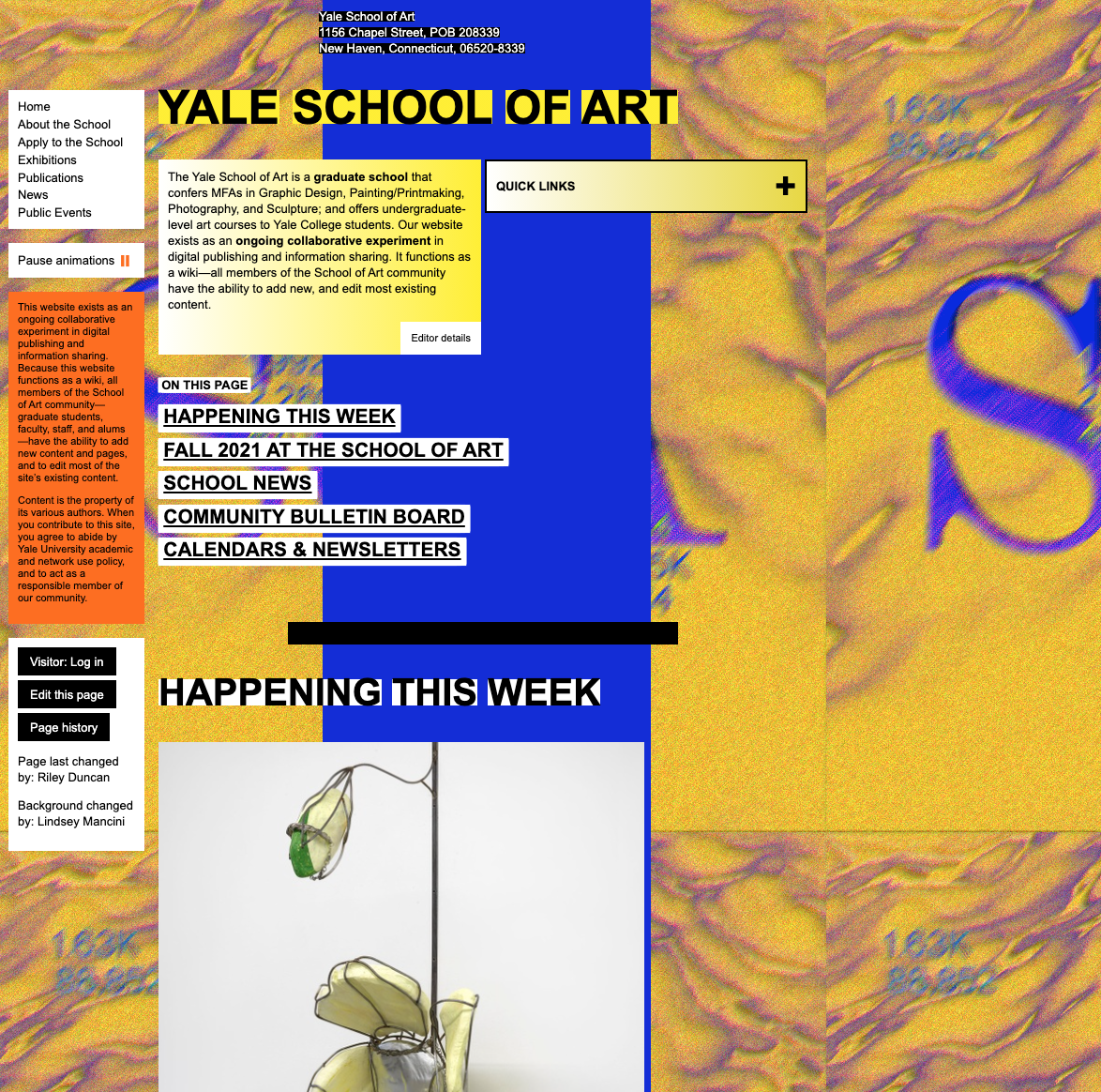
Let’s look at an example that can teach us a lot about the need for balance in customization: The Yale School of Art.

Admittedly, this is an extreme example of customization’s negative impact on usability, and this site shies away from balance on purpose as part of its mission. Yale School of Art students are known for their collaborative, experimental, edgy, artistic talent. They create out-of-the-box pieces that the university displays and showcases. The school’s site is an extension of that artistic view, allowing every member the power to change anything they want in the interface.
Be that as it may, this extreme customization makes the site almost totally unusable for people who want to take actual important actions, like applying for the school or finding out what’s going on in the program. Even the Yale School of Art could find a bit more balance that allows creative customization while still helping human beings use the site for its intended purpose.
You Can’t Forgo Usability
You may think that the Yale School of Art example is so out there, your customization features could never lead people to such usability disaster. Not so. There are many examples in the wild of how ungoverned customization can lead to unusable digital experiences.
Take this screen from the B.E.A.C.H Charters VI site, for example.

This example isn’t even a customizable site, just one of the many ways people can go astray when they aren’t digital experts and are left to their own devices. The text in the screenshot for the B.E.A.C.H Charters VI site below is hard to read because it has low contrast with the background image and is bright red, a difficult color on any background. It will be very difficult for most people to read this text and understand what this page is trying to convey.
Readability of text is one of the first things to go when an untrained person starts to customize a digital experience. There are many reasons for this — the desire to include a beautiful photo conflicting with the need to say something on the page. Or a lack of understanding of color contrast and color theory in general. When you give your users control over text color and text background color, you open a whole world of color combinations, some of which you might have never known existed.
Take a look at the different color combinations on our extreme example. Would you enjoy reading this screen for long?

Protect Readability
You need to set some rules to ensure your site is easily readable through even the most thorough of customization jobs.
- Don’t let people customize text colors. It’s simply too easy to make a mistake with text color, and your content has valuable information that your users need. Lock down your text colors—the text itself and the background it sits on—so that content remains readable.
- Limit how images can be customized. When you let users choose any background they desire, you open your interface to problems with readability, particularly when it comes to allowing images as the background setting. Instead, allow customization of images in particular areas and sizes, where they can add to content instead of distracting from it.
Guard Against Layout Chaos
When you let clients put whatever they want wherever they want, chaos ensues. Your content hierarchy and logic of your layout quickly breaks down. Important things get demoted to a lesser-viewed area of the screen. Less important things take a place of prominence.
This is how you end up with the News page from the Yale School of Art. Here, order and placement of content have no rules and thus, are displayed so haphazardly as to become incoherent.

If your site or app doesn’t have intuitive organization, your users are going to be easily overwhelmed. They’ll grow frustrated trying to find information on the page. Creating a template for your clients or partners to customize within will help keep the chaos at bay. You will need to closely govern what can be customized within that template. Without clear rules, it is easy for users to break everything to the point of reducing page content to nonsense.
You might be thinking that this doesn’t happen outside of the Yale School of Art site. Oh, but it does. Remember MySpace? The site is a golden example of what happens when content creators customize the interface. In its new incarnation of hosting pages for musicians and other entertainment figures, it’s still a customization nightmare. Some of the biggest names in the industry have pages on MySpace and it is, quite frankly, a mess. In large part, that’s due to lack of rules and governance about layout.
Even Lady Gaga is on MySpace. Take a look at the first view visitors get of her page. Is this any better or more usable than the Yale School of Art?

Customize in Harmony
This page could still offer whatever Lady Gaga and her people wanted it to, but remain usable with some governance rules in place for layout.
- Set the template: Create a page template that allows for different types of information and let your users work within that template. This prevents users from breaking the interface, ensures some kind of usable content hierarchy is preserved, and keeps the screen from breaking on smaller devices.
- Set governance for content length and presentation: Nobody wants to face walls of interactions, text, or options to look at, but often clients want to display everything all at once in the most prominent area possible. Set rules for how different content types are displayed and how many of each type display at a time.
- Follow proper heading hierarchy: Without headings, there is no way to organize your content. Your layout rules must account for headings that move in correct hierarchical order, even as the content is customized, to maintain your content’s logic and progression.
Limit Lists
Lists are often overrun with too many items and have zero categorization. Lists are meant to be organized, short, and make it easy to find information fast. When you give your clients or partners the option to add what they want without any governance, you end up with long, unorganized, and abundant lists full of every item imaginable.
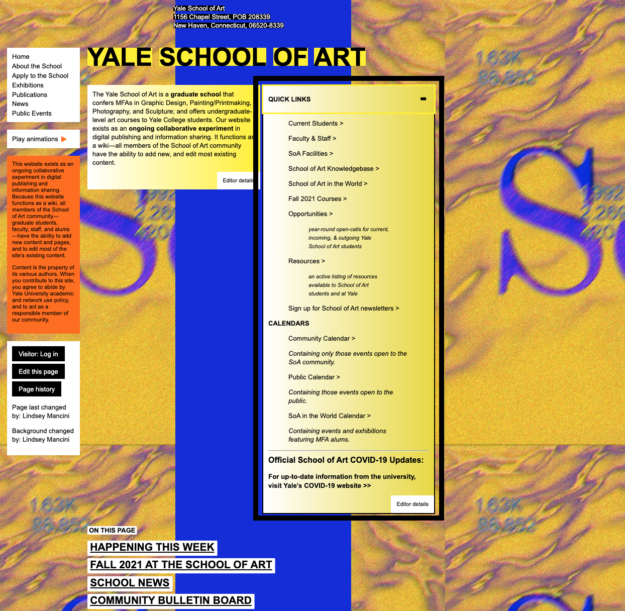
Like so many other sites guilty of the same list faux pas, the Yale School of Art’s long list of links is unhelpfully named “Quick Links.” And like so many other sites guilty of this same customization flaw, these links are not well-categorized, so users have to read every item in the list to find what they need. It turns out “Quick Links” are never really that quick.

It’s easy to get carried away with adding items to a list. Those uninitiated to how UX works can always think of another item that should be in a list. Usually, these long lists are born of good intentions to present important items in one prominent spot. But, we all know what it’s like to have to interact with a long, unorganized list. Save users the headache, and provide governance for any and all lists on your interface.
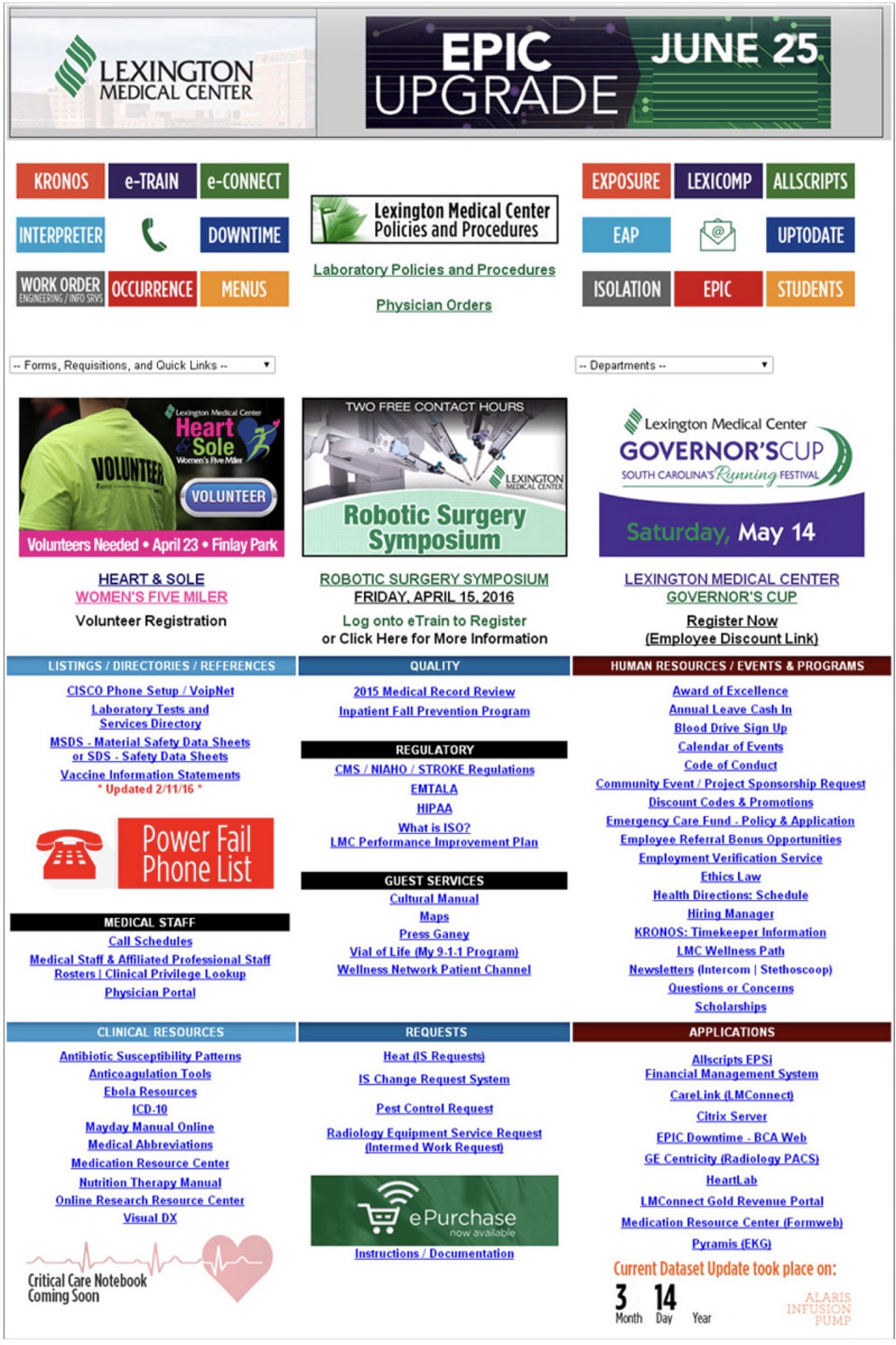
The following example of a hospital network’s old intranet provides a classic example of what can happen to lists without governance guidelines in place. Everyone wanted everything on the home page and, without rules in place for the interface, that is where everything went. Everything that is valuable to the intranet is here, true, but the number of lists and the length of each list means it takes way too long to find what you need here.

Create Rules for Lists
Limit the kinds of lists your interface allows and what they are called, as well as the number of items that can be in any given list.
- Define what lists can exist and what they are called: Giving your clients the power to name lists will cause vague list names at best and, more typically, uncategorized lists of something like “quick links.” Instead, give your users the ability to add to lists you’ve determined for them. Also limit how many items they can add to the list and, if they can link list items, restrict link text to the name of the page or document they are linking to.
- Limit the number of items in a list: Limit the number of items that can be added to a list, depending on what you are showing. For example, if you’re going to show items with multiple elements each, such as a news article with image, description, and link, you might set your limit to three news articles to show at a time. Or, if you’re showing a list of helpful text links, you might limit the list of links to no more than seven per list.
Customization Balance is About Governance
You can allow customization of your interface for various situations and products where customization would enhance the experience. But make sure that you’re going about defining how your screen(s) will be customized to ensure governance rules are in place to prevent content creators, clients, partners, and even end users themselves from breaking what’s there.
When you let your clients customize within a set of rules and predetermined structures, you’ll avoid the many mistakes that are caused by free-reign customization. That’s how you walk the delicate balance between customization and usability to avoid ending up looking like an experimental art site.


