Dos and Don'ts For Creating Powerful User Personas
6 min read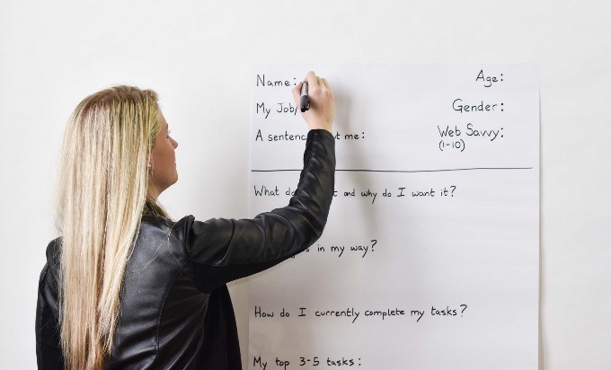
When used correctly, user personas, which visually communicate data about a group of users through single representative person, can be a powerful tool in the creation of digital products. They can light the correct path forward for your website, application, or software suite. Personas can clarify user goals, actions, and headaches. They can uncover important issues hard to discover any other way. Many organizations use them. But! There's a way to create them that will help your project succeed and there's a way to create them that…won't.
First up, a little-known secret: You actually need two types of persona templates.
You read that right, to create personas that are useful, successful, and all of those good things, you actually need not one but TWO types of templates.
Types of Persona Templates
1. Persona Creation Template
This is a large-format template you'll ask real users to fill out by hand. (Seriously, real users. We mean it so much we wrote a thing about it.) The Persona
Creation Template asks the pertinent questions you need answered to understand the people who will use your digital product.
2. UX Strategy Persona Template
This is a formal persona document you'll create based on input from users. You'll put this one together after you've analyzed the information from the Persona Creation Template. You'll take a look at what your users said, (or what you've gleaned from direct observation) and boil it down into concrete, evidence-based findings.
The Persona Creation Template
What does it look like?
The Persona Creation template is simply an easel-sized sheet of paper taped to a wall or whiteboard.
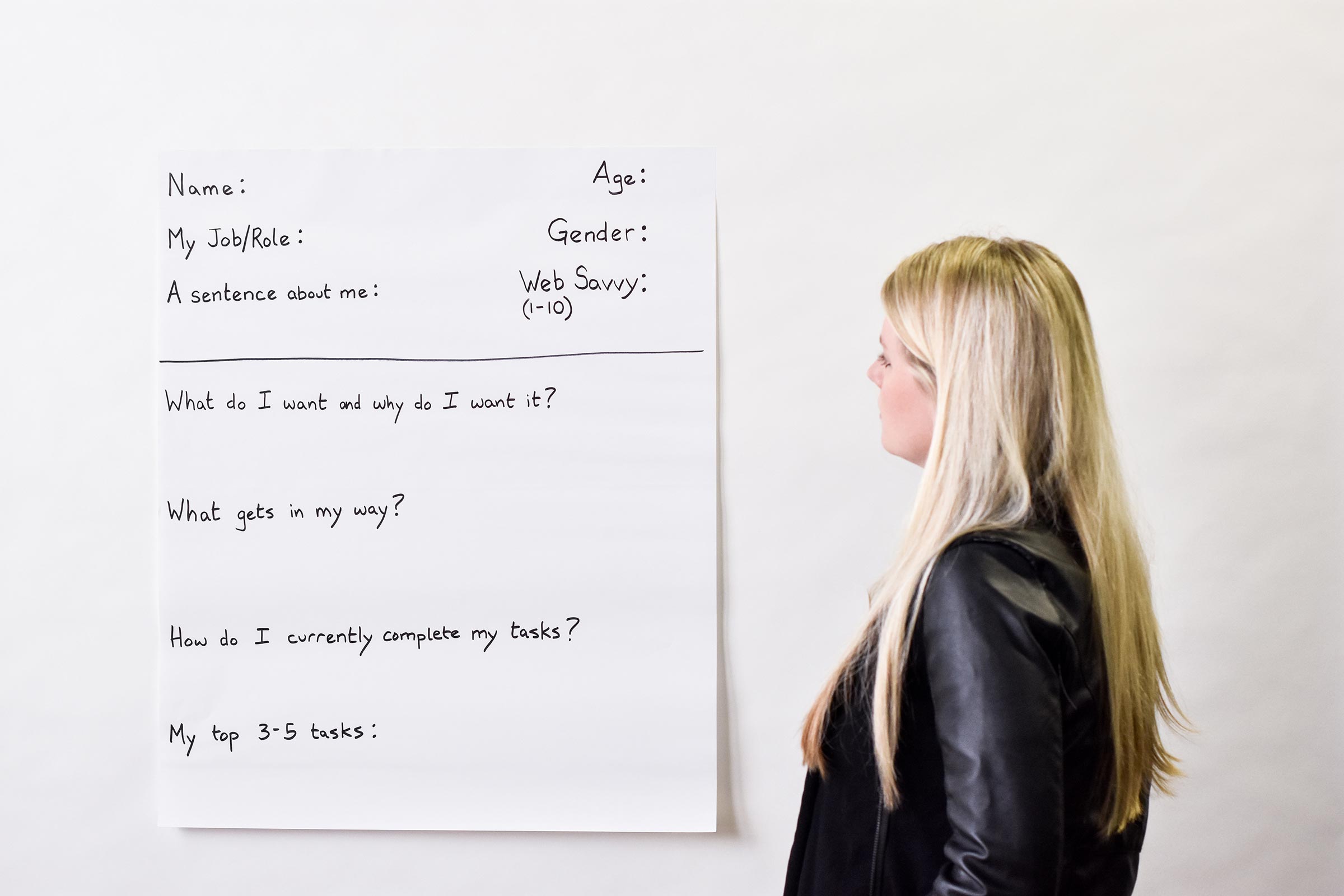
How do you use it?
Armed with sharpies, post-it notes, and scientific curiosity, get a group of representative users together. Explain that you want to understand them better, then ask them to fill out the template as best they can. They'll describe themselves, their tasks, and what affects those tasks.
Pro Tip: This exercise is highly effective and more thorough with a group of similar users rather just one person. We'll often have groups answer the questions for themselves, then rotate to another user template for to make additions, clarifications, or even corrections. When everyone has contributed, we discuss the personas as a group.
Keep in mind…
You're trying to learn what users do today and how your digital product could help them do that more easily, quickly, and sanely in the future.
Do:
- Stick to users' real-world tasks. - No need to get fancy with excessive demographics.
- Focus on the present. - Ask users about what they do now and what they wish they could do.
- Identify frustrations. - What frustrates users about their current tasks or product use?
- Personalize. - Give each persona a name, chosen by your users of course.
- Make it easy. - These templates should be easy to fill out. We write ours on easel-sized paper and typically tape them to a wall for users to write on. (With the client's permission to put tape on their walls, of course.)
Don't:
- Prioritize traits over tasks. - Don't make the mistake of asking about traits more than tasks or jobs that people do.
- Focus on erroneous detail. - Favorite color, waffles or pancakes, first concert - none of it matters if it doesn't relate to user tasks.
- Fill this template out for your users. - Make them do it. Some will like it, some won't. No coaching.
- Forget to invite your client and/or stakeholders. - This process yields evidence that's hard to argue with. Make them part of it and they'll be singing your song right along with you.
- Skip this step! - You and your users will be sorry if you jump straight into development.
The Bottom Line
We could sum up the creation template like this: Tasks, tasks, tasks. Hey user, what do you need to do, what do you do to get it, and what makes you want to tear your hair out about doing it?
What else do we ask?
Occasionally, we'll ask about education or another trait we know is pertinent to a particular client's users. But we only ask about the traits that will directly impact how people use the product. It doesn't help us that Persona Lauren Robinson is a Generation X-er with three kids, two mortgages, and a heart of gold if none of that's relevant to what she needs from the product we're creating.
UX Strategy Persona Template
What does it look like?
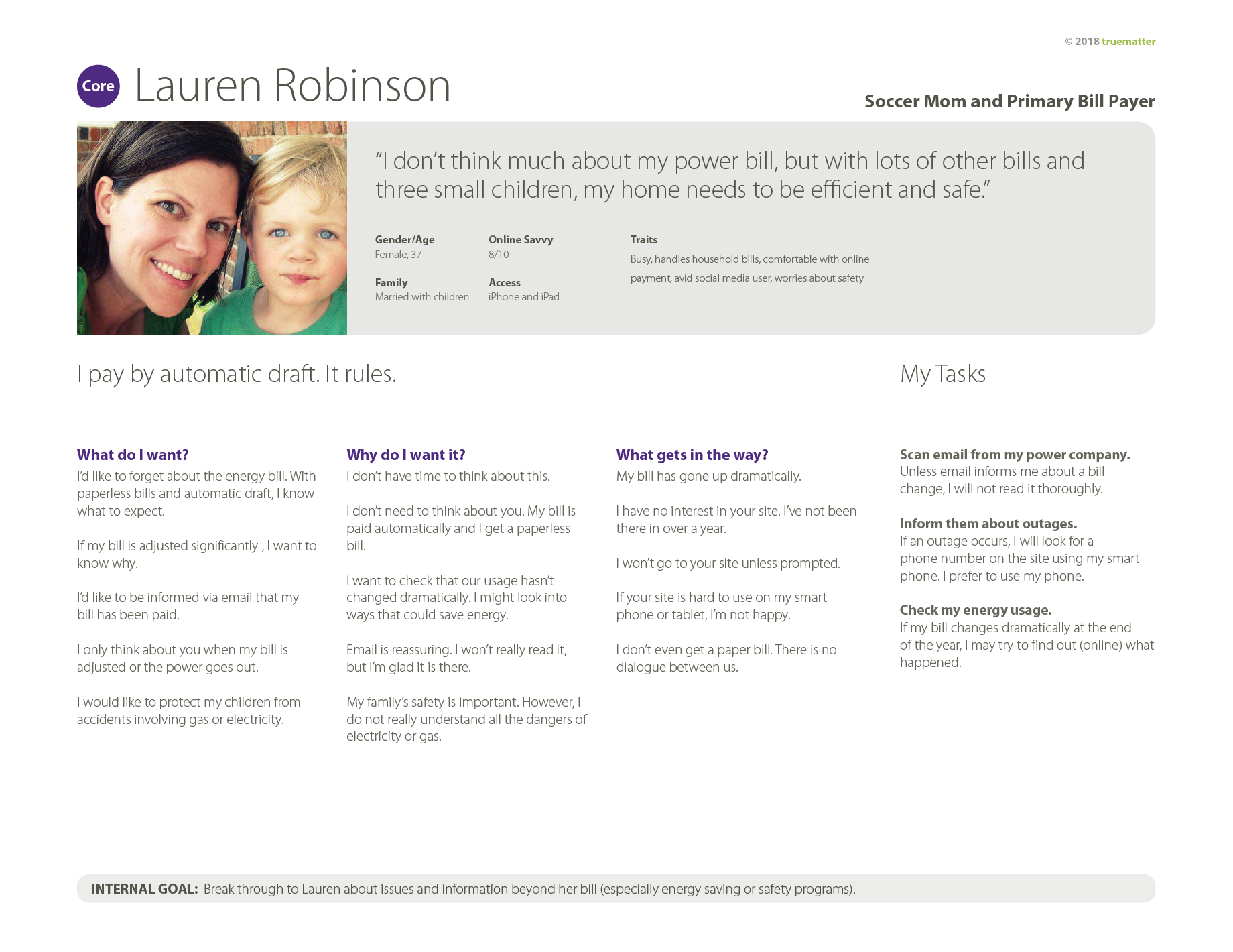
The UX Strategy Persona Template is an 8.5 X 11 document. You can create it using whatever program you most prefer. It's delivered as a PDF.
When do you use it?
Remember, you're only ready to fill out this template once you've had users fill in your large Persona Creation template. Hands off until then.
This template represents expert UX analysis.
The UX Strategy Persona template doesn't require brand-new work. It's your professional analysis of the creation template. Once you've looked over what your users said (and hopefully have observed them doing their job), you're ready to process it into this strategic template. This is the finished product you'll show your client and stakeholders. It's also the document you'll refer to when you're making mid-project decisions. "Oh right, Persona Lauren Robinson needed this."
Keep in mind…
Make your finished UX Strategy Persona Template insanely easy for anyone to scan. Readers should get the gist almost immediately. Too much is too much. Even the CEO needs to be able to glance at this and know what's going on with Lauren. No heavy reading allowed.
Do:
- Focus on tasks. - Put the majority of the effort into defining user tasks.
- Show real photos. - Give your personas photos that represent them as real people, flaws and all.
- Include other research. - Include information you got from users that might not have been strictly part of the persona creation template.
- Provide quotes. - Include a quote or something similar (taken from your creation phase with users) that humanizes the data.
- Make it easy. - Make it wonderfully simple.
Don't:
- Get wordy. - No one (not even this content strategist and writer) can easily digest a full paragraph per persona.
- Use model-perfect stock photos. - These are real people. Real people don't look like airbrushed movie stars. They really don't.
- Include irrelevant information. - We don't care if users prefer orange to red if their tasks don't depend on the preference. If users mentioned a specific, like location, and it affects their tasks, include it. If not, leave it out.
- Let clients guide your work. - Don't allow stakeholder or client goals to take over your persona. This is not the place for that. When it comes to personas, users first and users last.
Pro Tip: You might notice we included an internal goal for the client in this template. At the bottom. Clearly labeled as internal. In tiny print. This is a reminder to consider the internal business goal AFTER you make sure you've identified what users actually need. Internal goals and objectives do need analysis and clarification, but not in the context of personas.
There's Something In It For You, Too…
Asking about (and observing) real-world tasks is the only way to get persona information that will help you create intuitive, easy-to-use digital products for your users. Easy for users means they get their tasks done. Users getting tasks done means more conversions, leads, engagement, etc. for you. And, of course, more conversions, leads, engagement means project and business success. So, do use task-based persona templates. Do ask real users about their tasks. Do also observe users completing those tasks. And do enjoy the huge ROI you get back from it.


