The Hawaiian Missile Alert Fiasco: How One Confusing Interface Caused Mass Hysteria
8 min read
Your customers share a common experience. They are constantly vexed by confusing, unclear, oddball digital interfaces. Most of the time, this amounts to frustration for customers and loss of business for you). But sometimes, poorly designed systems pose a legitimate danger to us all.
The Missile Attack That Wasn’t
One day in early 2018, Hawaiians were going about their business when a distressing message popped up menacingly on their cell phones and digital highway signage:
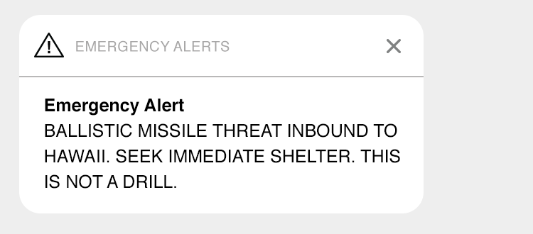
The Panic
If you live on an island within missile range of North Korea, say Honolulu, you’d be understandably distraught. And Hawaiians certainly were. For 38 long minutes, a full-on panic took hold. Car accidents were reported. People sought shelter, assuming they might be killed. One can only imagine the frantic calls to family members.
The tension was finally broken by a second message, assuring the population they were in no imminent threat of incineration by Kim Jong-un. But the damage, as they say, was done.
So What Happened?
Officials from Hawaii’s Emergency Management Agency (HI-EMA) had intended to conduct a simple missile alert drill. But somehow, they initiated a real missile alert. Since unholy fire was not actually raining down upon the Aloha State, a mistake had clearly been made. Or, perhaps, multiple mistakes.
Mistake #1 – Poor Design
Early reports placed blame on a monumentally confusing alert system. Upon request, a HI-EMA representative allegedly sent a screenshot of the offending interface to the press. It looked like this:
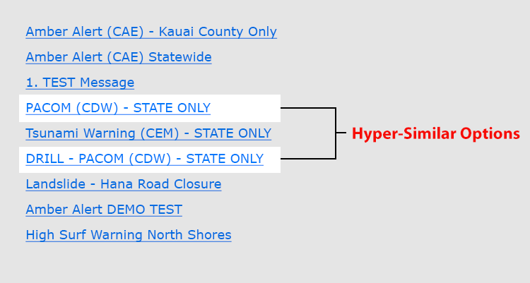
Evidently, the link “DRILL - PACOM (CDW)” initiates a simple test procedure, whereas “PACOM (CDW)” sends apocalyptic text messages to, well, everyone.
One can see how a stressed emergency worker might make a mistake. After all, the links for missile drills and actual missile attacks are decidedly similar. But the closer you look, the worse this list becomes. Most links are written in acronym-speak and there appears to be no clear pattern to the presentation. The list is also nearly impossible to scan quickly. If one were so inclined, one might also ask why procedural drills and end-of-existence alerts are on the same list in the first place. But I digress.
What We Really Meant Was…
When the cracker-jack HI-EMA team realized their screenshot had reached the light of day, they cried foul, saying they intended the list merely as a sample of available emergency options. It did not represent the full system interface. They refused to show the full system, however, presumably for security purposes but quite possibly out of embarrassment.
Instead, they provided a revised new sample interface to the press:
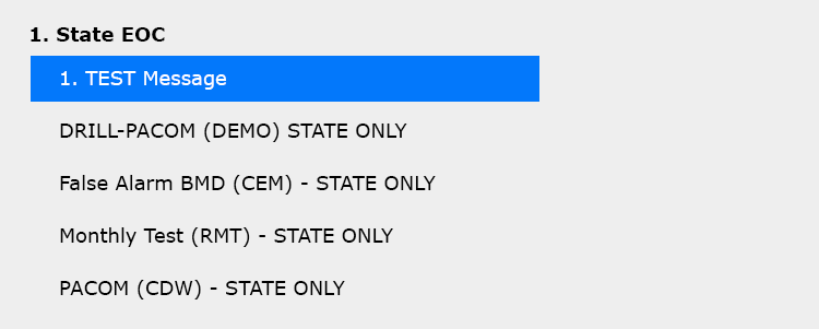
The core problems of poor naming, odd presentation, inappropriate associations, and curious capitalization remain. Bravo.
It’s possible this revised treatment was accompanied by an exhaustive explanation, glossary, or perhaps at least a user manual. I’m not sure. But one thing feels certain: Only a hopelessly myopic bureaucrat would consider this revision an improvement, let alone a defense of the agency or its systems.
Digging Deeper
If we had only these two samples, we might easily blame the entire episode on poor design. But as is always the case, there appears to have been more to the story. Determined journalists uncovered what may be the full emergency alert interface, or at least a generic version of the system probably used in Hawaii.
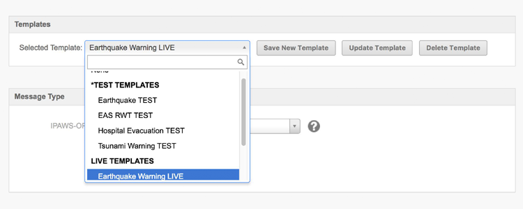
The list we initially saw is just one screen from the larger system. The entire alert process is more complex, consisting of multiple screens and decision check points. Presumably, this guarded against error. I picture a confirmation screen stating, “Are you SURE you want to send a scary, apocalyptic alert to every citizen of the state?”
Funny thing, if this is indeed the right system, it kind of does exactly that.
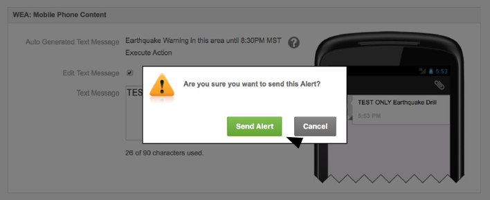
This is a clumsy presentation, but at least the user must confirm an action. The rest of the system’s UI is clunky despite being “regarded by FEMA as one of the most intuitive and easy to use in the industry.” This perhaps says something about the industry. But even if imperfect, is the interface design the primary reason for the great Hawaiian missile panic of ’18?
Mistake #2 – Poor Content Choices
All systems (even well-designed ones) are at the mercy of humans. Someone at HI-EMA had to conceive and write all alert options, get them approved, and organize them into understandable, scannable lists. Let’s compare HI-EMA’s list with the generic system option:
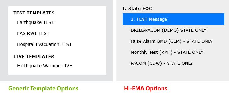
The generic sample’s alert list (left) is quite clear. Written in plain English, it is scannable and segmented by test and “live” alert options. Not bad. HI-EMA’s options, on the other hand, are an awful mess.
Somewhere on the way to the finished digital product, content strategy and presentation got hopelessly mucked up, multiplying the potential for error. This problem can be laid plainly on the doorstep of HI-EMA. An underlying design problem was made worse by poor follow-through and bad content practices.
Mistake #3 – Poor Process
Now the story takes an odd turn.
Only after acknowledging design and content problems can we look to the user. Which brings us to the offending technician.
The employee who initiated the false missile alert claimed he acted carefully and correctly. He felt a fully legitimate missile alert, not a drill, was called and initiated the proper alert message warning of a real missile attack. In his mind, the mistake was HI-EMA’s, not his. The interface played little role.
Of course, HI-EMA claimed the opposite. They said the technician misheard calls for a standard drill and either made a careless mistake or was negligent. Either way, after an investigation, the technician was fired.
Whom do we believe?
Both parties have a vested interest in their stories. If the technician is right, internal processes, alert safeguards, quality control, and general communication utterly failed. If HI-EMA is right, an employee with a history of problems ignored processes and made a grievous error. The confusing interface didn’t help matters any.
No matter what, process was part of the problem. The FCC’s investigation agreed, concluding that HI-EMA had “a lack of reasonable safeguards or controls in place,” things you tend to want when it comes to missile alerts.
Where does this leave the UI?
When HI-EMA first responded to the false alert, they initially blamed the interface. The governor even claimed an employee, “pressed the wrong button,” a defense only Steve Jobs could love.
This may have been spin control, an awkward deflection of blame. Awkward indeed. By letting slip the cringe-worthy interface sample, they admitted to poor, ineffective processes. They purchased and implemented a software product. They allowed content to become (and stay) confusing.
An understandable, intuitive system is itself a safeguard against problems. A poorly designed system filled with confusing options poses a significant danger for error, even if surrounded by the most solid of processes, a luxury apparently unavailable ay HI-EMA.
Failure has many fathers.
So the great missile mistake wasn’t inevitable. But was made more likely by a flawed digital product ecosystem which featured:
- Poor Product Usability – The makers of the system, despite claims to the contrary, offered a decent, but less-than-intuitive digital product, sadly normal for software.
- Inadequate Training – The vendor probably did not train HI-EMA in proper content naming and organization practices. (Few if any software teams do this).
- Lack of Content Know-How – Almost certainly, HI-EMA couldn’t recognize or correct basic content problems.
The Fallout (so to speak)
Miraculously, no one was hurt during the 38-minute missile scare, though a heart attack was anecdotally associated with it (and became a source of litigation). But what can organizations learn from this fiasco?
1. Functional software is only one part of a greater equation.
The fact that your software performs a desired function cannot alone ensure success or safety. Rather, that software must be:
- Easy for people to learn and use.
- Supported by effective internal processes and communication.
- Policed and maintained to conform with usability principles.
- Complimented by excellent error recovery capabilities and processes.
- Revisited and improved periodically.
2. Small interface problems quirks can make the biggest difference.
This entire hubbub is about similar options in a drop-down list. Every part of your UI should be obvious and intuitive.
3. Your UI is almost certainly not as great as you think.
In software and apps, mediocre is often the norm. Good enough is not good enough, especially when it comes to your business, or the safety of the public.
The Risk of Poor Interfaces
Organizations routinely tolerate digital products far, far more poorly built than HI-EMA’s alert tool. As a result, businesses are less efficient, can’t easily exploit market opportunity, and are open to costly errors. When it comes to safety, the consequences can be dire. Don’t get me started about Three Mile Island.
You can do better.
If you rely on mission-critical digital products, build simple, usable interfaces and surround them with strong process and best practices. Your customers will thank you with their business. And, who knows, you also might just prevent unnecessary mass panic.
Related Reading


