How Green Was My Delusion: Perception and Reality in UX
5 min read
When I was a young man, intensely focused on courting the beautiful Angela Lawrence, I harnessed prodigious reserves of creative energy to impress her. I wrote long letters, sent flowers, and meticulously crafted mixtapes (it was the late 80s after all). I drew pictures, flattered her for hours on the phone, and of course, bought gifts I could not afford.
Untold eons of evolutionary sculpting demanded such displays of plumage. This was preening at its best, or at least the best I could manage. It all seemed to be working, at least until I nearly blew it by giving her a tone-deaf present.
The Perfect Gift
A reader and quasi-intellectual, I thought it brilliant to gift Angela a book. No normal, run-of-the-mill book would do. I gave her my favorite book, How Green Was My Valley by Richard Llewellyn. I found it emotionally resonant and deeply moving. It's fair to say it stirred my hormone-drenched soul.
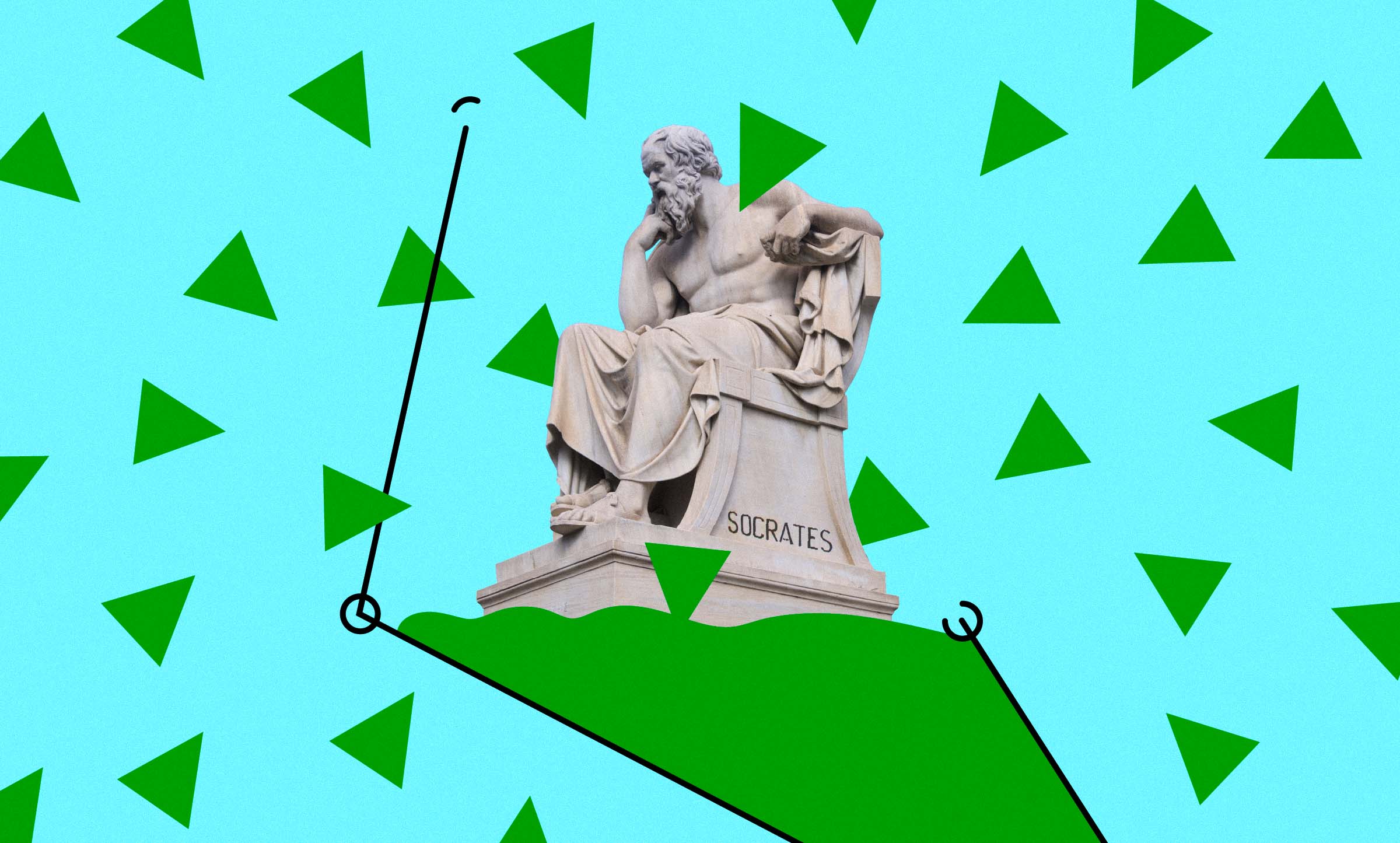
Now, before you think I'd done something magnificently romantic, let me disclose the essentials of Llewellyn's novel. It takes place in late 19th century coal-mining Wales. It follows a young boy, Huw Morgan, as his family and way of life are utterly decimated by encroaching modernity. His bucolic, unspoiled valley gradually surrenders to horrifically monstrous slag heaps, by-products of ravenous coal mining. Along the way, Huw charts a course of personal discovery that includes questionable decisions and a touch of moral failure. Nearly everyone dies. Nothing is resolved.
Ms. Lawrence was, shall we say, unimpressed. Apparently, she was none too keen on depressing novels that ended badly. She preferred uplifting stories full of characters with clear purpose and personality. Happy, or at least satisfactory, conclusions stirred her heart. She wasn't looking for a bleak coming of age story. What made perfect sense to me was, for her, just awful. She hated it.
I made a classic mistake. I gave her the gift I wanted. I loved the book. Surely she would, too. It moved me. It was important to me. Me. Me. Me. Hells bells, I gave it to her on Valentine's day, a green book on the reddest day of the year. I assumed she would see the genius in it. She would stand in awe of the glorious sunlight reflecting off my resplendent feathers. She did not.
The False Consensus Effect
Shouldn't I have seen this coming? I'm not so sure. I did something most of us do unconsciously, all the time. We believe other humans see the world as we do. We filter reality by our own thoughts and experiences, our likes and dislikes, and our immediate environment. Curiously, we ascribe these preferences to others. This phenomenon is known to social psychologists as the false consensus effect. We overestimate how many people share our views and tend to feel, mistakenly, that most people are similar to us. They must think the way we do.
This is why, if you're a liberal living in progressive Portland, Oregon, you probably assume your neighbor has left-wing opinions. If you're a conservative from Republican enclave Lubbock, Texas, you naturally think your neighbor is a righty. Similarly, if you are an exuberant young male with a penchant for grim, downer novels, you undoubtedly think the woman you're pursuing will feel the same way.
This is why I gave Angela the wrong book.
What That Means for Digital Products
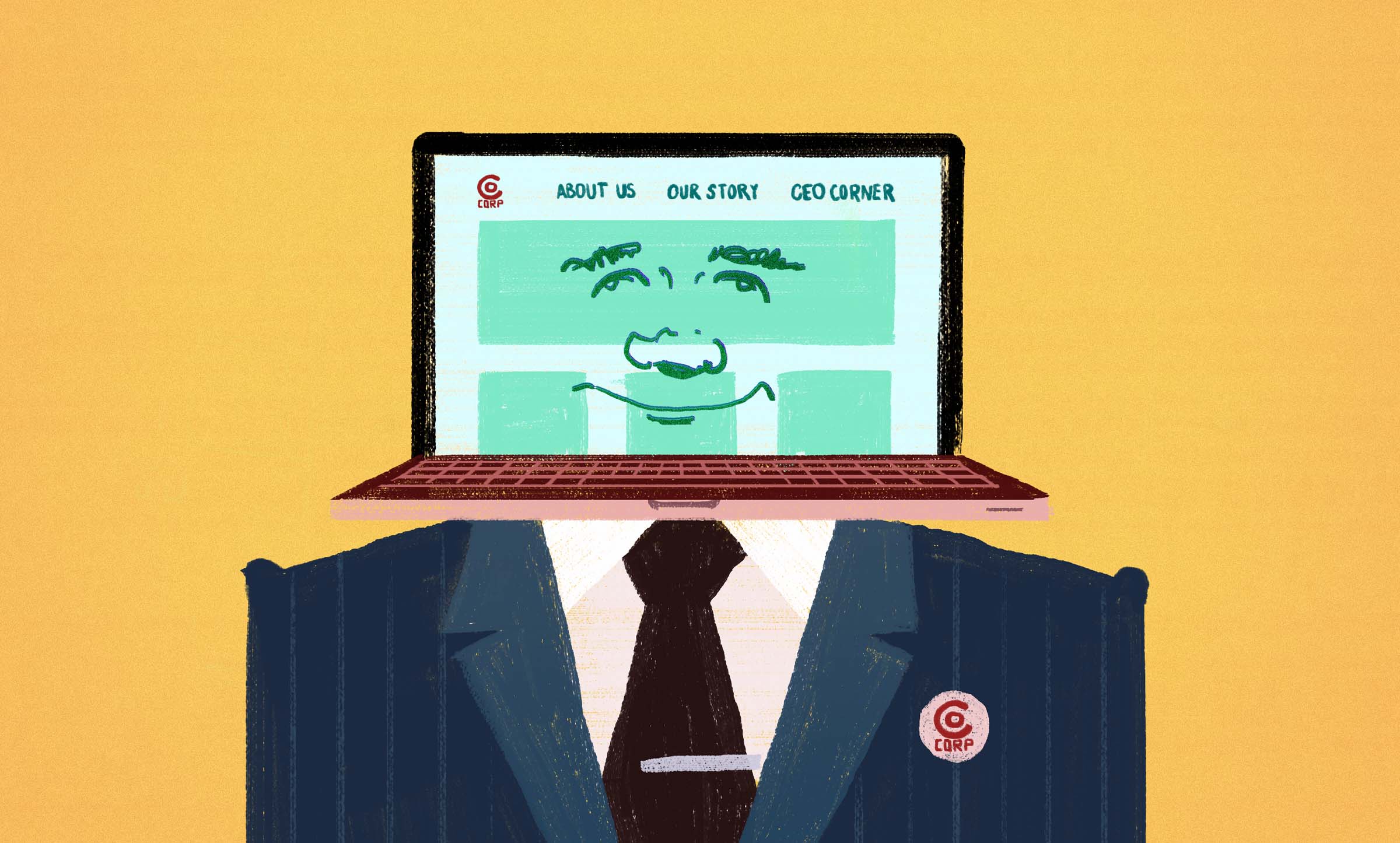
We see the false consensus effect all the time in websites, applications, and software. If you think most people are just like you, it affects the things you make for them. If digital product creators consider their users similar to them in knowledge, experience, and behavior, they'll make certain design choices. That is, they'll design for themselves. Developers find it most expedient to make interfaces fit for, you guessed it, other developers.
It's no wonder why most digital products are maddeningly difficult to use. They have not been made for real people. They are, unconsciously or not, largely made by power users for power users. Surely you know how to best query a database from a search field. You use CTRL+F regularly, right? Split menus? No problem. Pop-up window anyone? It turns out false consensus wreaks havoc with far more than awkward courtship rituals.
Real people want easy. They want courtesy. They want quick. They don't want to feel like idiots. They want a happy narrative with a satisfying conclusion. Instead they are given the digital equivalent of a collapsed Victorian-era coal mine (spoilers).
Developers are hardly the only ones to blame. Executives demand sites and apps that reflect internal organization, use excessive jargon, do too much, and imitate competitors. This is because they tend to live in a corporate bubble, use 1,000 acronyms a day, live to sell more and more features, and are jealous of their peers.
Don't believe me? Go online and try to change your insurance coverage.
I am not Angela. You are not your user.
In user experience (UX) circles, we confront this problem with a simple reminder: "You are not your user. You are not your customer." That's it. A simple change of perspective solves the problem. If makers of digital products decide to treat their users as unique individuals, most interface frustration would begin to disappear. After all, when you want to serve someone, you consider them, spend time with them, and walk a mile in their shoes. Then the answers become startlingly obvious. Real people regularly get tripped up by your log-in process. Most users think your app does too much. They have no desire to read 95% of what you write. That's not Angela's kind of book. See? Easy.
By the way, Angela was perfectly polite about receiving How Green Was My Valley. I'd like to think she was blinded by my raw, animal masculinity. But it's more likely she was uncommonly patient. She read the book cover to cover and gently offered a contrary opinion. Though it wasn't her cup of tea, she informed me it did not disqualify me as a suitor.
Your users may or may not express such mature understanding.


