No One Reads Online (Not Even You)
6 min read
Digital products run on information. Sites, applications, and software products constantly communicate to the people using them: how to complete tasks, what to know about a process or topic, what to do next, what’s gone wrong, how to get help, etc. The way you present your digital content can be the difference between making people happy and making them curse your name as they tear their hair out in frustration.
In short, words are critically important. But here’s the rub. No one is actually reading them.
You may not believe me. You may have even heard before that people don’t read online and you still don’t believe me. But it’s not only true, it’s science.
Your Brain on the Web
Let’s clear the air a little before we continue. People do read certain things online. When your whole goal is to read an article or e-book or your best friend’s super long social media post, you read. However, when your task is nearly anything else, reading goes out the window.
A Common Non-Reading Task
Here’s a familiar example – going to the doctor. Nothing about it is fun. You’re either sick, think you might be sick, or are going even though you’re not even sick. But you still need to accomplish certain tasks related to your visit.
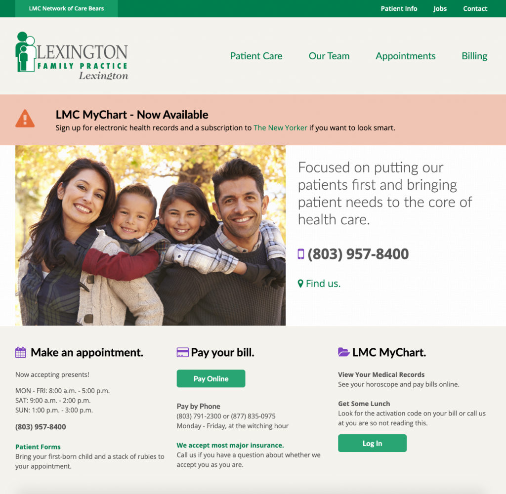
Take a look at the home page for a doctor’s office website below. What can you do here? Maybe you want to see appointment times. Maybe you’re looking for your doctor’s phone number. Or – ugh – you need to pay your bill.

While you set about these tasks, your brain is automatically going to do a few things.
Look for keywords.
Your brain knows what it’s looking for. It associates certain words with the task you need to accomplish. Paying your bill? “Pay” and “Bill” will jump off the page. But if the site unexpectedly calls your bill a “statement of indebtedness” instead, you’ll have a much harder time.
That’s because your brain isn’t reading the page word for word. Instead, it’s skimming to find particular words related to your task. When it can’t find them, frustration sets in.
Tune out noise.
Your brain is amazing. It rapidly skims for relevant words and ignores irrelevant ones. You’re very likely to look at most of the words on a given screen without even registering their meaning.
Moreover, human peripheral vision is terrible. So while we’re finding the one word we need, we focus on only about 10% of the screen at any given time. A big slimy lizard creature could be hanging out on the edge of your vision and – as long as it never moved – you would probably continue in oblivion, looking for the word “bill” or “pay.”
By the way: More words = more noise.
Avoid overload.
It doesn’t matter how smart or educated you are, our brains are just not good at juggling multiple things at once. We can really only remember about seven things at one time (a couple more if you’re lucky, a couple fewer if you’re not). That’s why you go to the grocery store without your list and come out with a bunch of cheese instead.
That’s also why, when faced with fifteen options in a navigation menu or a page chock-full of actions, you have a hard time deciding what you need to do. The same principle applies to words – the more you have to look at and try to remember, the harder it is to be successful at using those words to complete tasks.
This is NOT laziness.
It’s easy to blame technology, shortening attention spans, the expectation of instant gratification, Generation Z, yada yada yada. But there’s nothing and no one to blame for us failing to read online. It’s simply the way our limited human brains are wired. No one is exempt. Not you, not me, not members of MENSA.
Look Closer
Let’s look at our doctor’s office home page example again.

Notice anything unusual?
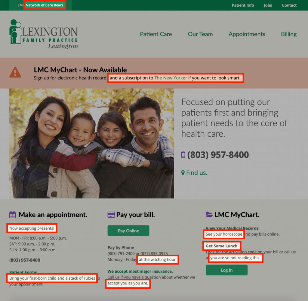
As you can see, we have taken editorial liberties with the page. Most of them are fairly ridiculous. And all of these additions were present in the first version of the screen you saw.
Be honest.
How many of these words did you see the first time around? Most people will see none, even as they’re examining the page and the things they can do. Those who do see the added words will only see one or two. We don’t read online even as we read about not reading!
That’s because you’re not looking for the word “horoscope” or “lunch” on your doctor’s website. These words don’t have anything to do with the tasks your brain knows you must complete. So, it simply ignores them.
You can’t write your way out of this.
The problem is not that your content lacks that compelling something. It doesn’t matter how entertaining, fascinating, intriguing, or mind-blowing your content is. If it’s slowing your users down, they won’t give it the time of day. You could explain the secret to life on our doctor’s office site and your users would blindly still be searching for the words “pay” and “bill.”
The problem is also NOT restricted to poorly constructed content. (Although the more dense, complex, and impenetrable your text, the worse it will be for your users.) No matter how well you’ve planned and written the words for your site or app, no matter how usable and courteous your words are, people are still skimming for the one thing they need. The good news? Knowing this gives you power.
How to Write When No One is Reading
So people aren’t reading your site or app word for word. That may sound like a bummer, but it’s actually a powerful truth you can use to your (and your users’) advantage. Get comfortable with that mindset because now it’s high time you made some changes in your site or app. Find and correct the following content mistakes that force your users, very much against their will, to read.
DON’T
Add paragraphs of text to any screen where users are trying to accomplish real tasks. By the way, words start to feel like a paragraph after two line returns in the digital world.
DO
Break up text into small, digestible, actionable chunks. Aim for a max of two lines in any given area of the screen.
DON’T
Present text without using headings and subheadings.
DO
Create clear headings and subheadings that clearly communicate the information they contain. If you can read just the headings and understand the entire screen, you’re on the right track.
DON’T
Hide words your users are looking for inside sentences or even longer blocks of text.
DO
Use keywords and power words in headings, subheadings, buttons, and links – these are the places people look first.
DON’T
Write instructional text explaining how to use a screen or complete a task.
DO
Write short and thoughtful labels, buttons, links, headings, etc. that make it exceedingly obvious what the user needs to do.
DON’T
Write more words for words’ sake. Don’t add words to make the design work. Don’t add words because you’re trying for a certain “tone.” This is just mental and visual clutter.
DO
Choose few, helpful, concise words where they are needed – no more and no less.
Rethink Your Approach
People don’t read online and, if you care about the success of your site or app, you shouldn’t force them to. Instead, rethink the way you approach digital content altogether. Stop writing words for someone else to read. Start writing words that someone else can actually use to get things done.


