Expert Panel Recap - Web Accessibility: Excellent User Experience for All
8 min read
Remember the show “So, You Think You Can Dance?” We are now in the era of “So, you think your site is accessible?” Except most organizations’ accessibility game is not nearly as strong as those contestants’ dance skills. That’s a problem for two reasons:
1. Digital accessibility became a legal requirement in February of 2019. The Ninth Circuit Court of Appeals has ruled that companies can legally be sued for non-compliance with WCAG AA accessibility guidelines.
2. Make accessible sites and apps is simply the right thing to do. More than 56 million Americans have some form of disability and may use assistive technology to help them navigate digital products.
In short, it can be difficult and time-consuming to make sure your digital products meet accessibility standards. But the alternative is losing a ton of business to competitors who do serve the 56 million+ Americans with disabilities and putting your company at risk for an expensive lawsuit and remediation process.
Take it from the experts.
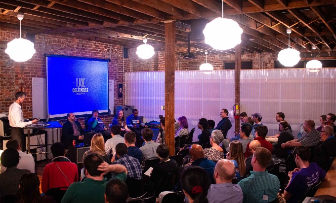
We hosted a panel of accessibility experts who use assistive technology themselves (screen readers, keyboard tabbing instead of a mouse, voice-to-text technology, etc.) to navigate digital tools. They people who interact with web accessibility daily, both personally and professionally, and told us a lot about why it’s so important to create truly accessible experiences for all.
The Expert Panel
- Cali Sandel, Employment Services Coordinator at Able South Carolina
- David Bundy, Assistive Technology Consultant at the South Carolina Commission for the Blind
- Dori Tempio, Director of Community Outreach and Consumer Insights at Able South Carolina
- Justin Williams, Independent Living Specialist at Able South Carolina
What We Learned (in a nutshell)
- Usability and accessibility often support one another.
- Users with disabilities give money to accessible sites and apps.
- Test your digital products with those who have disabilities.
1. Usability and accessibility often support one another.
If you focus on usability, accessibility will take care of itself with very few exceptions.
Apply the basic rules of usability.
Following user experience best practices will minimize issues for your users with disabilities. Ensure your developers are meticulous when applying elements such as labels headings, links, buttons, and fields. Use descriptive, straightforward language and avoid vague labels that rely on visual cues. These are all things you should already be doing for usability. They also happen to contribute to an accessible site or app.
For example, all of our panelists emphatically agreed that using the words “Click Here” for any link or button makes that element unusable for those who can’t see what “Here” is. It’s also horrible for user experience in general. Using clear, descriptive labels for actions benefits everyone using your site or app.
I have helped change a lot of sites’ usability and that made them much more friendly and accessible.
Solve the problem on both sides where usability and accessibility disagree.
It doesn’t happen all the time, but there are noticeable instances where the rules of usability don’t line up with the rules of accessibility. Some common areas you might find this disagreement include color palettes, search design elements, focus state use, and PDFs. When the issue does arise, it’s up to the team creating the site or app to find a solution that satisfies both sides. Too often, organizations decide to sacrifice usability for the sake of an accessibility solution or vice versa. You can and should find a strategy that accomplishes both, even if it takes a little more creative problem solving and brain power.
If you do usability first, many times you’ll have a fairly accessible site and then you can go back and put the rest of the accessibility stuff in there.
Just passing legal requirements does not mean your site or app is accessible.
Using an accessibility scanner will give you an idea of whether your site or app is passing legal muster, but it won’t be able to tell you if your interface is truly easy to navigate for people with disabilities.
Go beyond relying on an automated accessibility scanner. Use assistive technology yourself to navigate a site or app. Is it easy to use without a mouse? By listening to a screen reader? By using voice-to-text? You will immediately see large accessibility holes your robot accessibility scanner could never have caught. Make this kind of quality assurance testing a regular part of your process for building all digital products.
A site might have passed the letter of the law to be accessible but it’s [still] not actually accessible.
2. Users with disabilities give their money to accessible sites and apps.
Sites that aren’t truly accessible don’t get my business because I can’t use their service.
Pay attention to little details.
What seems like an inconsequential label or heading hierarchy to you can be the difference between a usable and unusable site to those with disabilities. And your site or app is too frustrating, users with disabilities will simply decide not to give you their business. Panelist Cali Sandel says she doesn’t allow a single inaccessible app on her iPhone. She won’t spend her time and money on something she can’t easily use.
Enforce accessibility guidelines and ensure your team reviews your digital products often to keep up with the most current accessibility requirements. The goal should be to create something that users with disabilities would proudly let live on their phone or laptop.
Everything has to be labeled.
Navigating pages with assistive technology takes much longer.
People with disabilities already face a steep learning curve to use the assistive technology they need to navigate online. For example, our panelists agreed that learning JAWS, a screen reading program that many disabled individuals use to access the internet, is like learning an entirely new language.
All of our panelists spoke about the amount of time it takes to navigate even the most accessible site or app. Any difficulty added on top of the work they already have to do to access digital tools is pure frustration and wasted time. If you frustrate them and waste their time, they’ll go elsewhere, likely to one of your more accessible competitors.
Forms are one of the most frustrating problems users with disabilities encounter online.
Forms are one of the biggest offenders for causing users with disabilities frustration and wasted time. If a form isn’t formatted properly, our panelists agreed it can easily take them up to four hours to complete alone, if they can complete it at all. Panelist Justin Williams said he has had to call in favors from friends because of unlabeled submit buttons and signature fields, adding to the amount of time and frustration caused by what was thought by site creators to be an accessible form.
Panelist Dori Tempio added that sometimes the forms you fill out online aren’t forms you want others to have to help you with. Sometimes they contain personal or identifying information like your social security number or private medical information. She also pointed out that not everyone has a friend or colleague available to help. Some people with disabilities have to call a phone service to get someone to help them fill out an inaccessible form online and in that case they often have to give their sensitive information to a stranger.
If you can take away the frustration that so many sites and apps put these users through and make an intuitive, accessible experience that doesn’t taken any more time than it has to, you will be the company that gets their business over your competitors.
I have taken hours upon hours upon hours to find what I want online.
3. Test your digital products with those who have disabilities.
Our skill set is disability, reach out to us and ask for input.
You don’t know what disabled users know.
It is impossible to truly put yourself in the shoes of someone with a disability. The only way to fully understand if your digital product is accessible is to have users with disabilities test it. When they run into problems, take careful notes about what went wrong and fix it. Then test again to make sure you got it right.
You should also include users with disabilities in your routine usability tests for any new site or app. Doing so will ensure you get both usability and accessibility right the first time. It will also help you create a strategy for finding a solution when usability and accessibility best practices don’t agree.
Apple got it right by putting people with disabilities on their research and development team.
Reach out to accessibility experts for help.
None of this comes easily for organizations. Making your site or app accessible takes time, budget, and fortitude. Many cities have ADA and accessibility organizations that can help. Look for accessibility experts who can offer help with workshops, accessibility testing and review, and assistive technology demonstrations. Bring your team so they can better understand the real people who need accessible sites and apps to go about their everyday lives. There’s nothing like seeing the need for yourself to change the way you think about how you create digital products.
If a blind person can use it, I’ve probably used it.
Assistive Technology Demonstrations
Our panelists gave us three demonstrations of assistive technology:
Watch each clip to see how real people navigate everyday digital tools like video players, forms, file folders, and internet search with assistive technology.
Get Started
Don’t wait for the letter from the lawyer to come in the mail. Get yourself an accessibility scanner if you don’t already have one and see what issues come up for your site. But don’t stop there. Hire accessibility experts to help you remediate existing sites and apps and build in-house accessibility knowledge for future digital products. Become the most accessibility-friendly team on the block and the most accessible site or app among your competitors. In the long-run, it will bring you more customers and fewer headaches.


