Taking “You” Out of User Experience
8 min read
It may seem counterintuitive but, at its core, your website or app should have very little to do with your company. At least as far as your mission, values, culture, and other internal concerns go. And there’s one very simple reason…
Your website or app isn’t about you.
Your site or app is for your users, the people who visit and interact with it. And—this might sting just a little—they just don’t care about you. You’re heavily invested in your company’s brand, goals, success stories, etc. and that’s as it should be.
But users are pretty selfish. They’re heavily invested in something too – the thing they came to do. They’ll consider any content or interactions unrelated to their needs as clutter, extra stuff they have to wade through to get to what matters, or—worst of all—frustrations to put up with. That means your structure, design, content, and every part of your site or app should directly reflect your users’ tasks. That doesn’t leave much room for internal company navel gazing.
Users will actively avoid you talking about yourself.
Users do their very best to stay away from anything that sounds like you talking about your stuff. We should call this the “Don’t Care Zone.” In a way, it’s encouraging that users know how to identify structures, interactions, and content that aren’t useful to them.
Users have learned to:
- Skip certain sections (e.g. “Our Culture”).
- Avoid internally focused navigation titles (e.g. “About Us”).
- Skim right past anything that smacks of internal navel gazing (e.g. “A Message from Our CEO”).
Users have learned to circumvent the content you put on your site or app that they don’t want to deal with. Great. But it’s not great for their experience when they’re constantly dodging this internal noise. It’s also not great for you if users decide to leave altogether because they couldn’t find what they needed in the vast sea of company content.
Recognizing the Don’t Care Zone
How do you recognize when your focus is drifting toward your navel? How do you make sure you’re not taking your users into the Don’t Care Zone? There are some common mistakes companies make all the time, and that you can avoid.
1. Half the site is about the company.
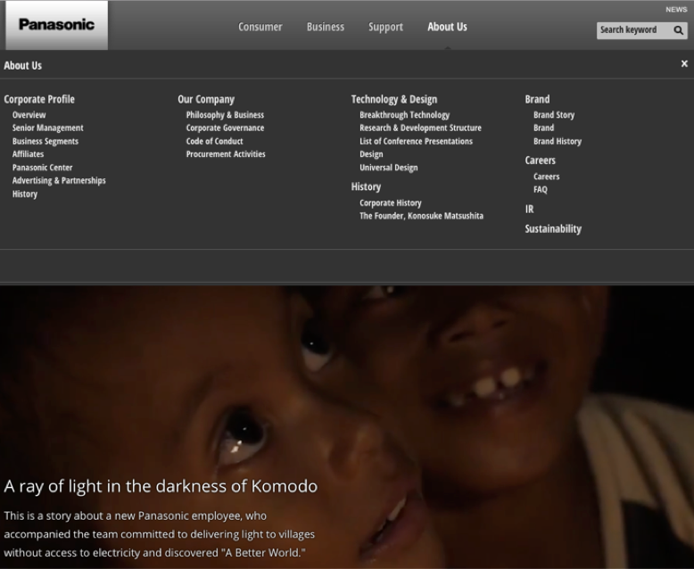
The About section is where content goes to die. Visitors have learned that “About” isn’t going give them what they’re looking for, so they simply don’t visit. The only users you’re going to find in “About” are desperate ones who are clicking through the site trying to find the thing they need, those concerned that you are a real company, or the ones looking for the Careers page.
Seriously, if the answer to the meaning of life was in your About section, users still wouldn’t go to it. So why invest so much time and energy there? Why even have one?
2. Reliving the company’s entire history.
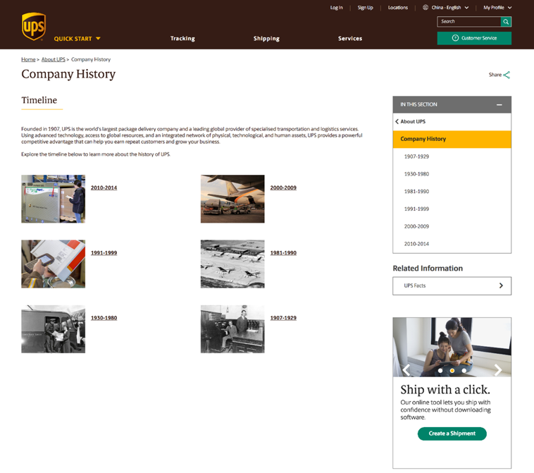
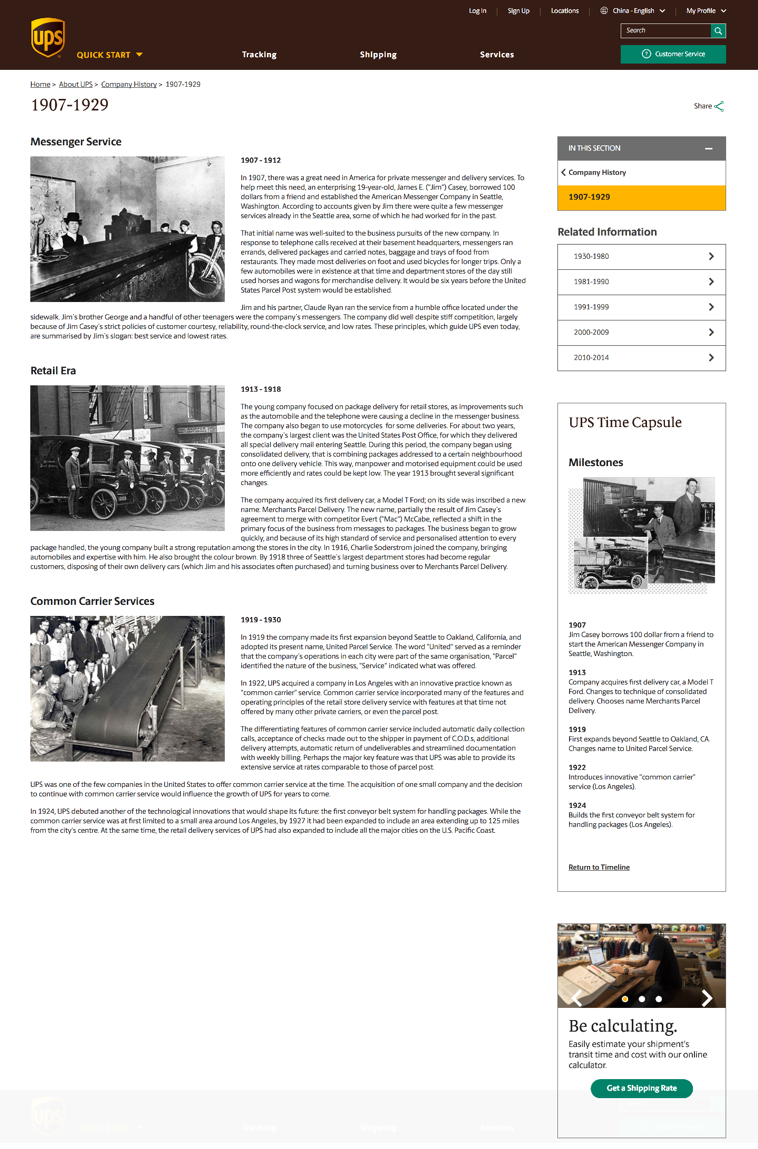
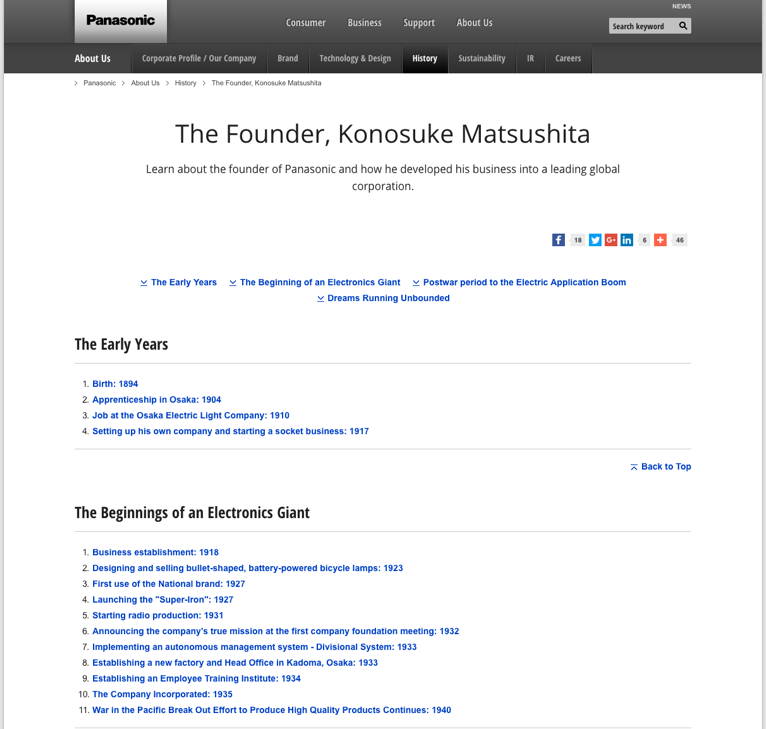
When is the last time you tracked a package online? Probably recently. When is the last time you investigated the history and background of UPS? Probably never. You know who is interested in that? UPS. Internal departments are keenly interested in where their company has been and the progress they’ve made over time, but users don’t show up for an extensive history report. It may seem that a history page (or section!) would prove expertise and longevity. But, since users aren’t going to read it, it’s either doing nothing or hindering visitors’ ability to use the site or app.
3. Writing novellas about your team.
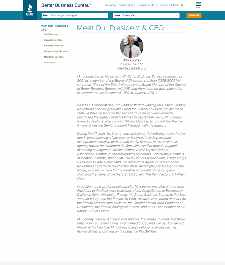
This is a tricky one. There are times users may legitimately want to find a member of your team. But close to 100% of the time, they’re going to be looking for that person’s contact information. The pervasive “Meet our CEO” is an especially egregious example of internal navel gazing. Here’s the CEO’s bio. No, you can’t contact them, but aren’t they great? When content is not related to core actions, users get frustrated. They didn’t come to your site or app to read a bio the length of the tax code.
One more example – we just had to include this one:
4. Explaining Your Culture.
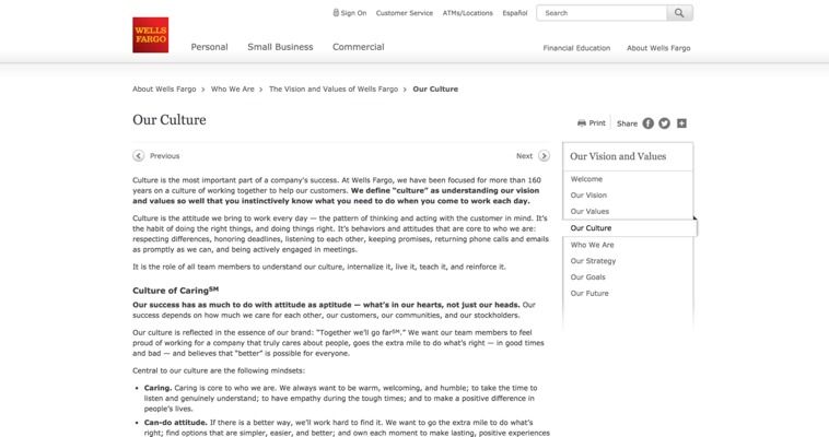
With the narrowly possible exception of prospective employees, your users do not care about the ins and outs of your company culture. They particularly do not care about the way you talk about your culture internally, branded business models, and all the other things that are so tempting to put on a Culture page. Culture pages, as Wells Fargo demonstrates, are breeding grounds for huge walls of paragraph text – also a huge no-no for your communicating with your users.
(We should also point out that, should you choose to invest energy in droning on about your culture, be sure you haven’t recently violated its principles publicly.)
5. Making users search for actions in a sea of company speak.
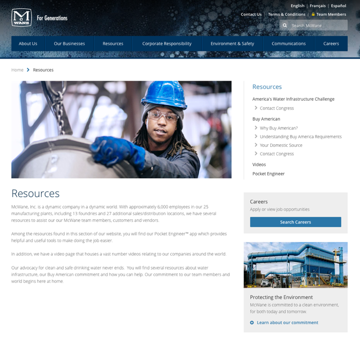
Safely quarantined in the never-read “About” section, your jargony internal-ese is harmlessly superfluous and self-centered. But if it starts to leak out into the parts of your site or app users actually interact with, it will annoy them, and eventually cause them to leave in frustration.
Do you enjoy reading corporate newspeak on the sites you visit? Of course not. And your users don’t enjoy reading marketing lingo, especially in any kind of volume. If users must read through endless internally-oriented content just to do what they came to do, they’ll give up and flee the Don’t Care Zone. Not good for them, not good for your conversions and engagement.
Can we make users care?
Yes. We can make them care. After all, these tell-them-who-we-are instincts aren’t completely wrong. Users do need to see your company as credible to feel comfortable clicking buttons or giving you business or generally interacting with your site or app. But this does not happen through large paragraphs about your company’s values, team member bios, or a dedicated About section. It happens through careful content, design, and UX strategy.
How to Make Users Care About Who You Are
It’s time to get a little sneaky. We already established users don’t care about your company, at least not in a direct let-me-read-all-about-you kind of way. So you have to use strategy to show them who you are while never straying from their immediate tasks and needs.
ALWAYS focus on user tasks.
Tie information about your company directly to user tasks. Present the thing visitors want and slip in a little about you at the same time.
Example:
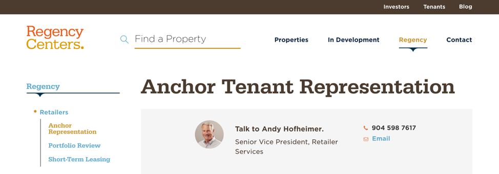
Here, users are looking to contact someone about becoming a major tenant for a retail shopping center. The action is clear: Contact Andy Hofheimer. But the presentation reflects something unique about Regency – their focus on people. Andy has a real, professional photo and the call to action uses friendly language that says hey, you can talk to us like a real person.
Even Andy’s title feels like helpful user-focused information instead of another title in a long list of names. The action is at the top of the screen. The user doesn’t have to wade through murky paragraphs extolling the virtues of becoming an anchor tenant. This shows users something very important about Regency: This is courteous company that cares about their time. We’re not trying to explain who Regency is, we’re showing it in the way we handle the experience.
Be helpful.
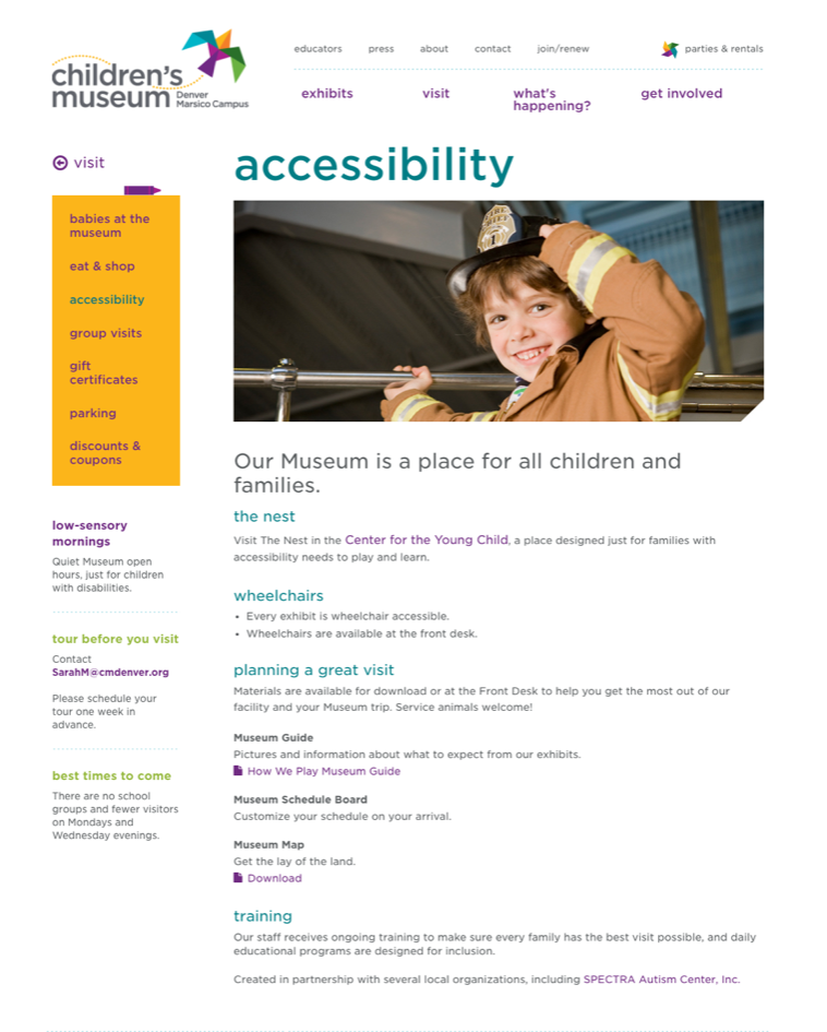
This could have been a dense page about the museum’s accessibility commitment and practices. Instead, we set it up to be user-focused, filled with practical information about accessibility on a visit to the museum. It still screams “we’re accessible!” without actually screaming it.
About content is BRIEF.

Lexington Medical Center could offer lengthy paragraphs about the value of being a DukeHealth Affiliate. But users would never read it. Mentioning it briefly makes it more likely users will take note, better affirming this hospital’s expertise in cancer treatment than paragraphs of text ever could.
Treat internal content like special call outs.

The South Carolina State Fair wanted people to know that it’s a self-sustaining organization that does good for the community, rather than a government-funded entity removed from the place they serve. Understandably, that information isn’t part of the typical users’ main tasks. We got it out of visitors’ way, but gave it a place of prominence right below the main content. We didn’t belabor the point either—users should be able to absorb this before they fully realize they saw it. No way they can do that with a paragraph or even a few full lines of text. Mission accomplished.
A Change in Attitude
You can’t force your site or app visitors to read through paragraphs of text about your company—they’ve already conditioned themselves to ignore it. Users focus relentlessly on what they want to do. Say good-bye to huge About sections, long-winded histories, letters from the CEO, explanations of your company philosophy, and other internal navel gazing.
Ultimately, getting your users to care about your company starts with showing that you care about them. That requires changing your attitude about how people use your site or app. If you make the action or content users came for easy to find and keep them out of the Don’t Care Zone, you automatically show them respect and courtesy. That will make them far more likely to stick around, do business with you, and care about the things you want them to care about.


