The Right Way to Build Forms
5 min read
Forms Are the Hardest Thing to Get Right
Digital forms are pivotal to many of the digital products out there. People use them daily to make appointments, pay bills, and apply for a job, just to name a few. For a business, they are integral for internal day-to-day work, and they can be the difference
between making a sale or losing one. Yet easy-to-use forms are the hardest to build.
Forms may be a pain to most people, but they don’t have to be. The least we can do as digital product creators is make them feel less like a hassle. By following these guidelines, you can build better, simpler forms that real people can easily use.
Best Practices for Building Easy-to-Use Forms
Don’t get creative.
Forms are not the place to innovate. Users have set expectations about forms that are supported by the standards and patterns we’ve all used for years. Deviating from common form standards makes it more difficult for the user because they have to
pay closer attention to what the form is asking of them. The less they have to think about what they are doing, the better.
Keep it short.
People don’t have time to fill out long, complex forms. Don’t be tempted to add more fields in hopes of collecting as much information as you can. We know you want to learn as much as possible about your customers, but adding more fields in
a form isn't the way. Only include the fields that must be there. The fewer the questions in your form, the more likely users will actually answer them.
Group related fields.
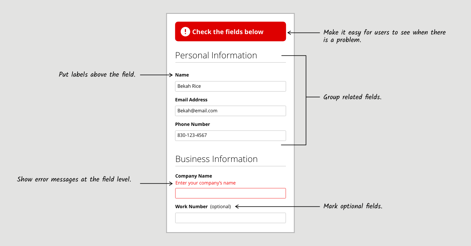
Think of the form as a conversation. You want it to flow naturally. Grouping related fields makes this possible and makes it immediately clear at a glance what information users need to enter. In some cases, it can also help them prepare for each part
of the form (e.g., by finding their bill with an account number on it) . Grouping related fields under clear, distinctive headings helps users easily digest the form and quickly fill it out. If you have more than three groups in a form, break it into
multiple steps to make the form feel simpler.
Mark optional fields.
Users assume that all fields are required unless otherwise stated. Instead of marking each required field, mark each optional field by adding “(optional)” next to the field label. This limits the visual noise because, ideally, you won’t
have many optional fields. It also makes it immediately obvious which fields users can skip, helping them maintain their momentum throughout the form.
Put labels above the field.
According to an eye-tracking study done by UX Matters, it is easier for users to quickly read labels when
they are placed above their respective fields. It keeps the user from needing to look separately at the label and the input field. While this strategy takes up more vertical space, it is better for mobile users and makes the information easier to
scan.
Reduce errors with masking.
It’s maddening when users enter the correct information but get an error message in return because the format was incorrect. For example, if a user has to enter their phone number, and you want the number with hyphens (“803-555-9456”) but the user types in the number without hyphens (“8038889456”), it can be confusing as to why they got an error in return.
Instead, use an input mask, which shows the user what format you expect and constrains the input—meaning no matter how a user enters information, it will be converted into the correct format. This technique helps reduce errors and ensures the information you receive is readable. It will also help people fill out forms more effortlessly.
Make it easy for users to see when there is a problem.
Online forms are frustrating enough, but to submit one and have nothing happen is the worst. A form without feedback forces users to work out what happened and leaves them questioning if the form submitted or if they even did it right.
If there is an error on the form, tell them! Create an obvious message at the top of the form that can't be missed. Use the color red to get the user’s attention and to let them know there is an error. Tell users exactly what they should do (for example, “Check the fields below”) so they can start correcting the error. Even better, when there are multiple errors on the page, save users time and automatically scroll to this message.
Show error messages at the field level.
Putting a list of all the error messages at the top of the form makes it difficult for the user to quickly fix their mistakes. It forces them to remember each error, find the corresponding field, and then fix it—all while scrolling back and forth
to ensure they didn’t miss any other errors. That’s a great tactic if you want users to feel dizzy.
Put error messages under the label or beside the field it is associated with to better support users in fixing their mistakes. Make errors red and keep them simple, so anyone can understand what is wrong and how to fix it. Doing this will save users a ton of time and frustration, helping them to quickly get back on track.
Tell users if they were successful and what they can do next.
Telling a user about an error is equally as important as telling them the form submitted successfully. Make this statement obvious and include any next steps for them to take. For example, after submitting a contact form, users should see a success message that includes information about when they can expect a response. If users got to the form from another page, return them there so they can continue what they were doing or start a new task.

A World with Better Forms
By following these guidelines and keeping the user in mind, we can greatly reduce the burden of forms. They can become less infuriating and hassle-free. Solving this problem will make one major part of the digital world tremendously less annoying. It
might not bring world peace, but it will make people much happier in the real world


