A UX Pro Walks Into A Fantasy Football League…
5 min read
I don’t know anything about football. And, even though I’ve been in a fantasy football league for two years running, I still don’t know anything about fantasy football, either. That puts me in a unique position when I’m trying to manage my fantasy team online. I get to be something I almost never am when I’m using a website or app: an outright novice.
Warning: If you are also a fantasy football novice, I apologize right now for the use of some light football lingo ahead.
The football language barrier, paired with my complete oblivion when it comes to players and the positions they hold, basically cancels out the fact that I work with sites and apps every day. I bumble around my league’s chosen platform like everyone else just to get anything done.
Because of this, I’ve always dreaded having to navigate my fantasy account. It’s frustrating and confusing on both the site and the app. I have gone to extremes to avoid logging in. Once, a friend sent me an urgent text to get online and swap out my defense because they weren’t playing that week. A good friend to be sure. But I still hesitated to go through the hassle of trying to figure it out online, even if it meant my team would certainly lose.
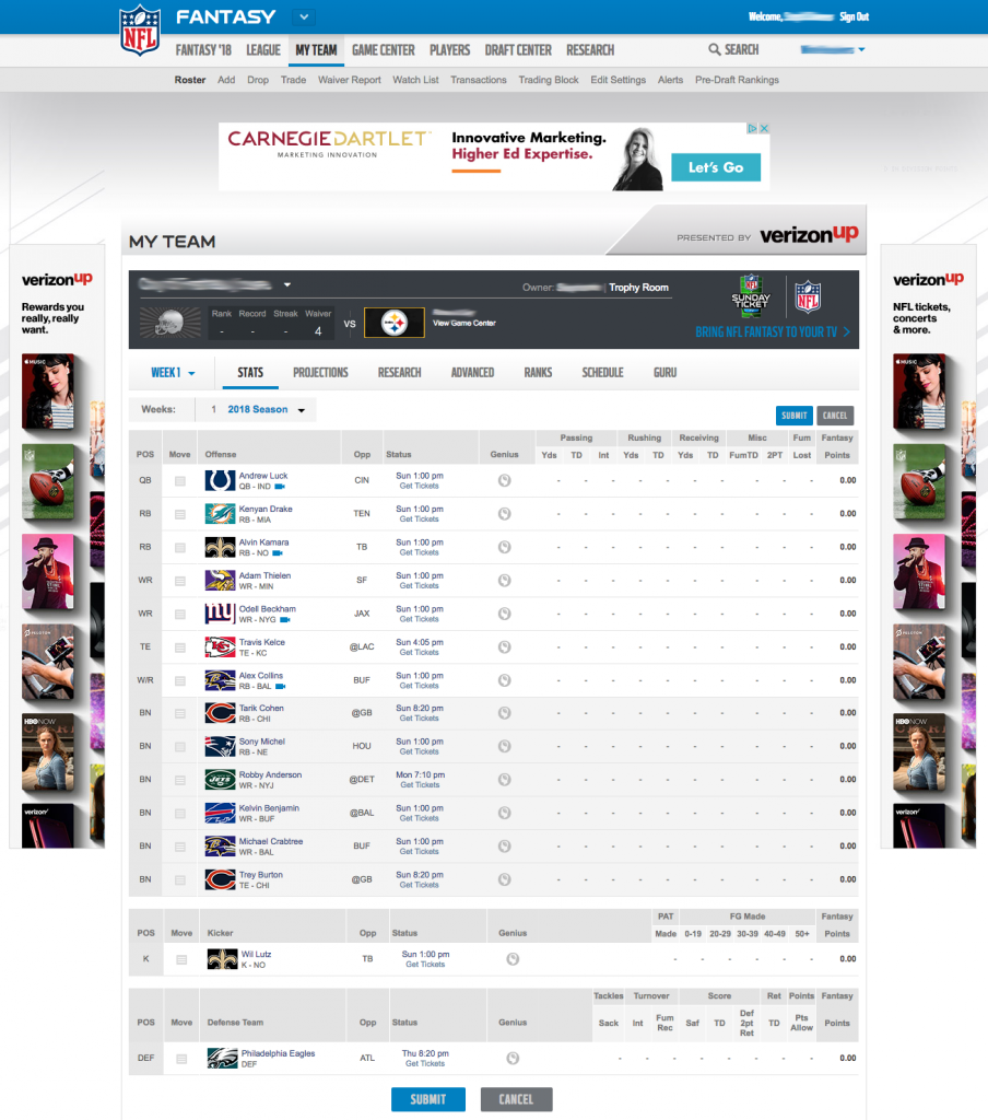
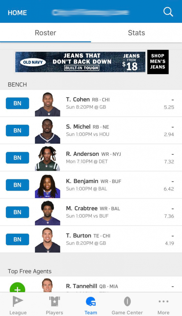
How Many Fantasy League Members Does It Take to Use the Dang App?
I’m not the only one who feels this way. My fantasy football league is a mix of football novices and diehard sports fans with varying degrees of low to expert tech-savvy. The other night, some of us were together, discussing the upcoming season.
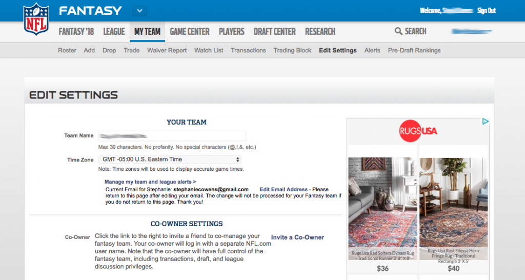
One new league member had gone to set up her online account and entered the league name as her team name. Oops. And she couldn’t figure out how to change it. “Help me change my team name before anyone else sees what I did,” she said. She pulled up the app.
League Member B, a football aficionado, offered to help. They pored over the app for a good five minutes (forever in digital product time), but got nowhere. They both gave up. “I’ll figure it out and email you instructions later tonight,” League Member B said.
Then League Member C had a question: “When’s the draft date?” (My fellow novices, this is when your league gets together and each person picks their players. By the way, the app does have an autopick option, which is nice. It allows me to pick players without knowing who they are. And to use the app or website without actually having to try to use it.)
The League Commissioner (fancy word for captain), stepped in to answer the question. “There’s a poll to pick the draft date,” she said.
“Did you send it via email?” League Member C asked, scanning her phone inbox.
“You can find it on your fantasy account,” the Commissioner (fancy captain) said.
Everyone groaned audibly at the prospect of having to use the site or app for yet another thing.
Our Commissioner rushed to the platform’s defense (after all, she’s the one who chose it). “Hey,” she said, “we use this fantasy football service because it’s the easiest one to use. If there were an easier site or app, we’d use that one.”
Pay attention, business person. Because that’s some real UX truth right there. If there were an easier way, an easier service, an easier site or app, we would use it. In a heartbeat. And your digital product users feel exactly the same way.
Good UX is the Real Winner
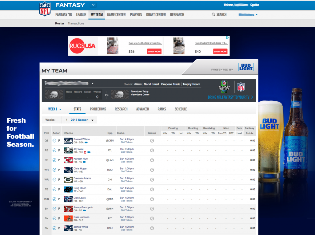
This scenario might be about fantasy football, but I’ve seen this exact same conversation play out with people talking about their company intranet, their bill pay service, their admin screen, their document management system, etc. It’s the same thing right down to asking a friend for help, writing down instructions for next time, and the audible groans. Not only would all of those people use any product that was easier, they actively create workarounds so they don’t have to use the existing product any more than they have to.
Your current and prospective customers are no different. If there’s an easier way, they’ll take it. They might ask for outside help. That’s the best-case scenario. They might also leave your site and give up on your product or service. Or they might go to your competitor instead. Nothing about a hard-to-use site or app will get you any business wins.
Now, the fantasy football services probably don’t care about any of this. They’re run by huge powerhouses (Yahoo, ESPN, the NFL) that do very good business in other areas. But unless you can say the same, your online success starts with being the best site or app for your industry and customers. Offering the best user experience out there will put you at the top of the market share heap. People will choose to do business with you because it’s easy. They’ll pick your site or app over the other, hard-to-use, frustrating sites and apps of your competitors.
In other words, forget winning in fantasy football – create an easy-to-use, well-planned site or app that serves your users and your organization will be winning in real life.


