Web Team Prizefight: Match Recap
7 min read
Hello and welcome to our replay of the greatest web match-up of all time, business analysts vs. UX professionals. In the left corner we have our BA, focused on the bottom line, keeper of business requirements, and ally of stakeholders. In the right corner we see our UX expert, a creator, problem solver, and ally of the user.
Can these seemingly opposed masters of their disciplines find a way to work together? Folks, you’re going to want to stick with us. Witness the clash of the immovable force and the irresistible object! This was certainly a match to remember.
Round One
 Karon Heape Senior Business Analyst at Unum Colonial Life
 Tony Samuels Senior UX Designer at Unum Colonial Life
The Defending Champion
Heape is a business analyst with more than 30 years of experience in software development. She knows all phases of the software lifecycle inside and out, client specifications through quality assurance testing.
The Obstacle
Heape and her team are overwhelmed by the prospect of updating an obnoxiously long, extremely old form with mystifying pre-set field selections and a usability index too minuscule to measure.
The Contender
Enter Samuels, a passionate UX designer whose career spans 10+ years. He’s never been knocked out.
The Match
Samuels takes one look at the form and deals the first blow: He wants to scrap it and start from scratch. Naturally.
Business analyst Heape, ever a keeper of budget and schedules, answers Samuels’ blow with her own: There’s not enough development time for a total rebuild. To rub salt in the wound, there’s no time to change any back-end functionality, period. Body blow!
Samuels side-steps and makes an artful compromise: The team will overhaul as much as possible in the product’s existing CSS to improve visuals, functionality, and overall user experience. Heape heartily agrees. They move forward together to simplify the form and bring it into the current decade.
The Outcome
After their shared efforts, the form is much improved. Heape says it’s more “simple, modern, and personal.” The project is a success! The crowd goes wild! Plus, their joint solution can be used again to surmount obstacles with other internal digital products. Creative collaboration saves the day!
Round Two
 Adriane Sagal Business Analyst at EDENS
 Kevin Benson Application Solutions Manager at VC3
The Defending Champion
Sagal has worked as a business analyst at EDENS for more than four years. She has a background in ecommerce and software implementation, not to mention an impressive skill set for dealing with advanced digital products.
The Obstacle
She has been tasked to make the EDENS intranet a better experience, particularly when it comes to search. With its tens of thousands of documents, the intranet’s disorganization and sheer mass intimidates even the mighty Sagal.
The Contender
Enter Benson, a UX expert who has worked at VC3 as the applications solutions manager for more than 15 years. He has the swagger of and savvy of a seasoned pro.
The Match
Benson sees that the current intranet is serving as a mere filing cabinet and wants to use a CMS for increased organization and communication capabilities.
Sagal strikes back. She tells Benson the stakeholders are used to the intranet simply holding files and doesn’t know how they’d respond to something different. She calls attention to the estimated two zillion documents they’d also have to contend with.
Instead of a war of attrition, they combine forces and convince the stakeholders that the new intranet needs a CMS with a data-driven, meta-data-tagged database, not to mention an all-out effort to categorize content.
The Outcome
Overcome by the duo’s intellect, the stakeholders see the light and agree to the solution. The intranet becomes a hub for company connection and quick, easy file searching. The site goes on to win an award for intranet usability in 2017. Sound the fanfare!
Round Three
 Shashi Tippabhatla Business Analyst at BlueCross BlueShield of SC
 J PerezUX Designer at BlueCross BlueShied of SC
The Defending Champion
Tippabhatla has several years of experience as a business analyst at BlueCross BlueShield of SC, bridging the gap between customer expectations and satisfaction. Her background in web development has given her a deep knowledge of IT products and applications.
The Obstacle
Suddenly and without warning in the midst of site testing, the client finds that users must delete their primary email before entering a new one. Confusion reigns. Fear not, the client has a solution. They tell Tippabhatla they want a biblically long explanation right above the email field to explain why users can’t just delete their old email.
The Contender
Cue Perez, a UX designer who has worked in the web design and UX field for 13 years. He’s having none of it.
The Match
Perez and his team believe users are intuitive enough to figure out what to delete and how to delete it without an explanation. Woah there, Perez!
Tippabhatla strikes back with the tried and true BA motto: “The customer is always right,” followed closely by an uncommonly cited maxim: “And the customer is not Einstein.”
Perez puts an end to the blows by conceding that some users may need an explanation. He maintains, however, that an explanation the size of the Great Wall will clutter the site.
Tippabhatla has an epiphany. She calls a meeting for the UX, BA, and development teams to find a creative solution.
Perez suggests a simple and concise tooltip, a message that only appears when the user is hovering over the delete field.
The Outcome
The client accepts the solution! Tippabhatla says this success “was possible only because of the cross-team conversations that had happened right on time.” Bravo team!
Round Four
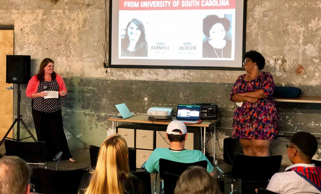
 Laurie Barnhill UX Designer at USC, Owned Media
 Hope Jackson Business Analyst at USC, Owned Media
The Defending Champion
With seven years in user experience design, Barnhill has amassed a powerful reservoir of UX skills and serves as the primary digital designer for sc.edu and the enormous eight-campus system.
The Obstacle
Barnhill and her small team are told they need to re-plan and rebuild well over 100 individual sites (filled with endless content) in the slight span of a few years. The team works mightily but only manages to complete 40 sites in four years. Not nearly quick enough to take them to glory! The massive project along with the looming deadline is too much for Barnhill alone.
The Contender
Jackson enters the ring as business analyst with her strong analytical reasoning and communications skills. She pumps her fists in the air, ready for a win.
The Match-Up
Jackson sees the quickly approaching deadline and slowly progressing sites. She makes her jab. She tells the UX team they don’t have the time to spend all day hashing out the details of every site. Shots fired!
Barnhill counters, reminding Jackson that every site must follow the project’s UX design guidelines and needs a careful review before launch. Quality!
The two hit on their big idea: They’ll streamline their process and hire outside vendors to help, leaving them more time to manage client relationships and perform careful site reviews.
They set up a meeting with project leadership. Using their diverse skills, Barnhill and Jackson persuade them to hire two new vendors. They also work together to create a production process that will have the sites humming along.
The Outcome
These two and their team knock out 100+ sites in two years: “Double the sites done in half the time,” says Jackson. They are now well on their way to meeting the previously impossible deadline. Incredible work!
The Results Are In
That’s it, folks. Now, who has won this web team prize fight? The BA? The UX pro? It seems like a close one. The judges are having a hard time calling it…
…Aaaand they’ve reached a consensus! Both BA and UX win! Who would have thought? In a shocking turn of events, these long-time rivals have joined forces for several astonishing wins. Unheard of! It would appear that the only loser tonight is the true villain of web teams everywhere: complicated, frustrating, painfully horrible digital products.


