The Worst Content Mistakes Higher Education Websites Make and What to Do About Them
8 min read
I’ve spent three years as content strategist and UX writer for an enormous, complex web project for a major university helping redefine, restructure, and rewrite their entire public website. During that time, I’ve seen some things I can never unsee – the very worst of web content transgressions. It would be bad enough if those disastrous mistakes were unique to that particular university’s website, but they’re not. In fact, they’re all too common practice in the online world of higher education.
Content Issues Are Serious Business
The content issues I’m talking about aren’t just cosmetic or a matter of preference. They are engagement killers that can ultimately wreak havoc on your department’s budget and even your university’s bottom line. And these problems don’t stem from a lack of intelligence – smart, analytical people are often creating this horribly unusable content.
So what’s going wrong?
1. An Unrelenting Internal Focus
Most universities tend to create their websites with an impressively unwavering internal agenda. This intense navel gazing is evident anywhere you look on most higher education websites. Here are some particularly egregious mistakes I’ve seen on nearly every university website ever:
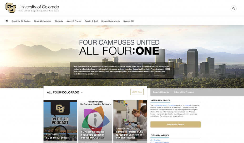
Inwardly Focused Navigation
Navigation structures that parallel the organization of university divisions, departments, and offices. These structures often only make sense to the people who work there (and maybe not even them).
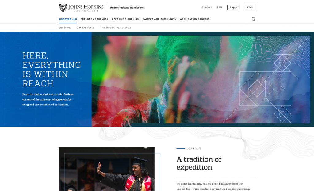
Jargon in Titles and Headings
Link and page names that use internal lingo real people using the website have never heard of.
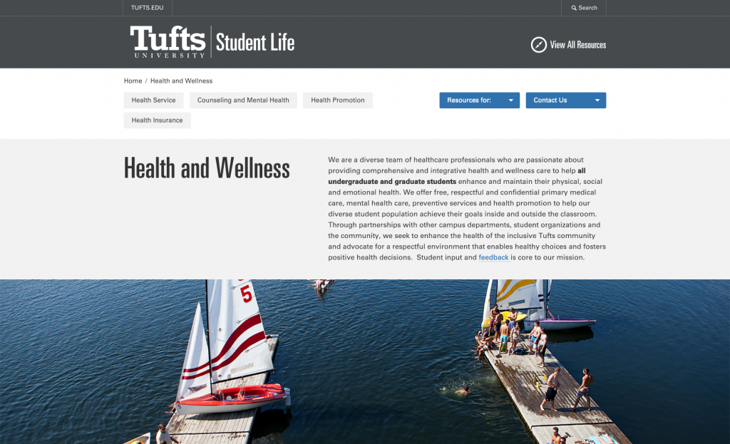
Excessive Content About the Department or University
The worst cases of this fill the home or landing page and several sub-navigation sections with content that has nothing to do with user tasks.
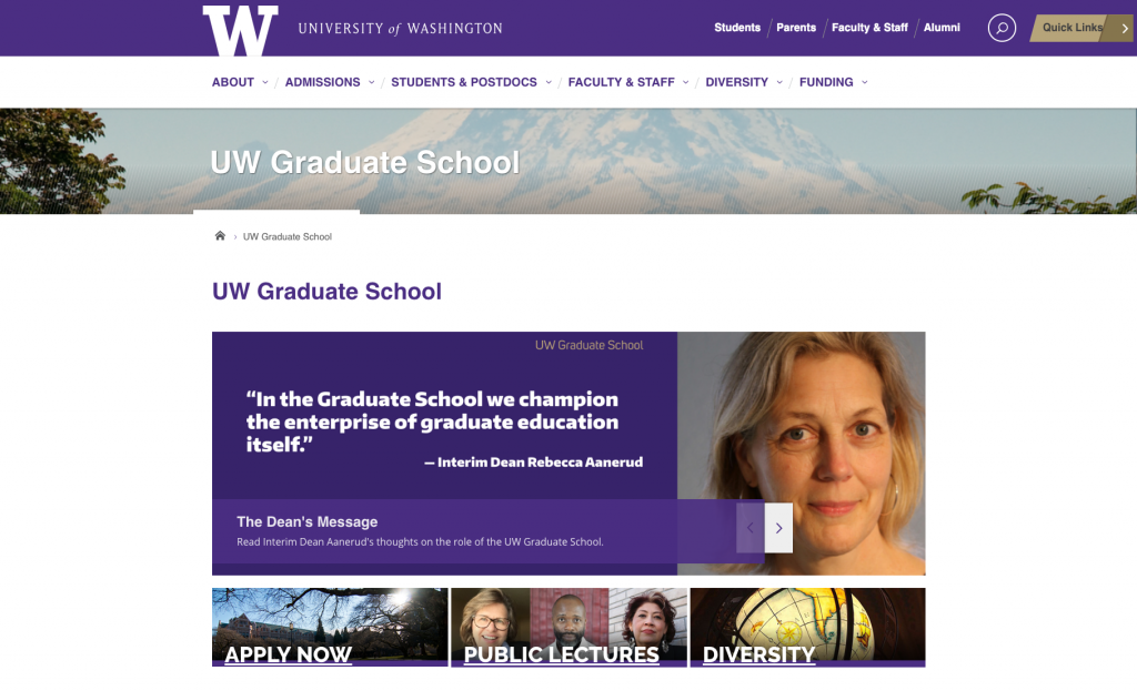
Irrelevant Greetings
Welcome letters from deans and department heads plastered on main landing pages.
Undue Focus on Internal Goals
Mission or values statements that take up prime screen real estate.
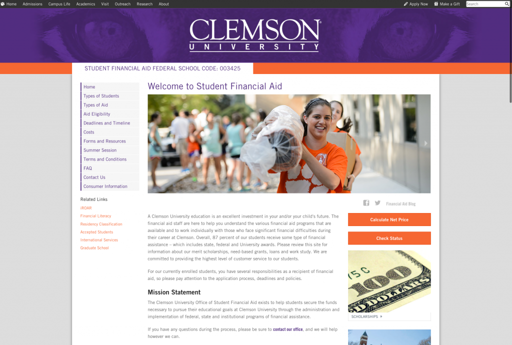
Putting Your Internal Concerns First
Featuring university initiatives, programs, and goals before user tasks.
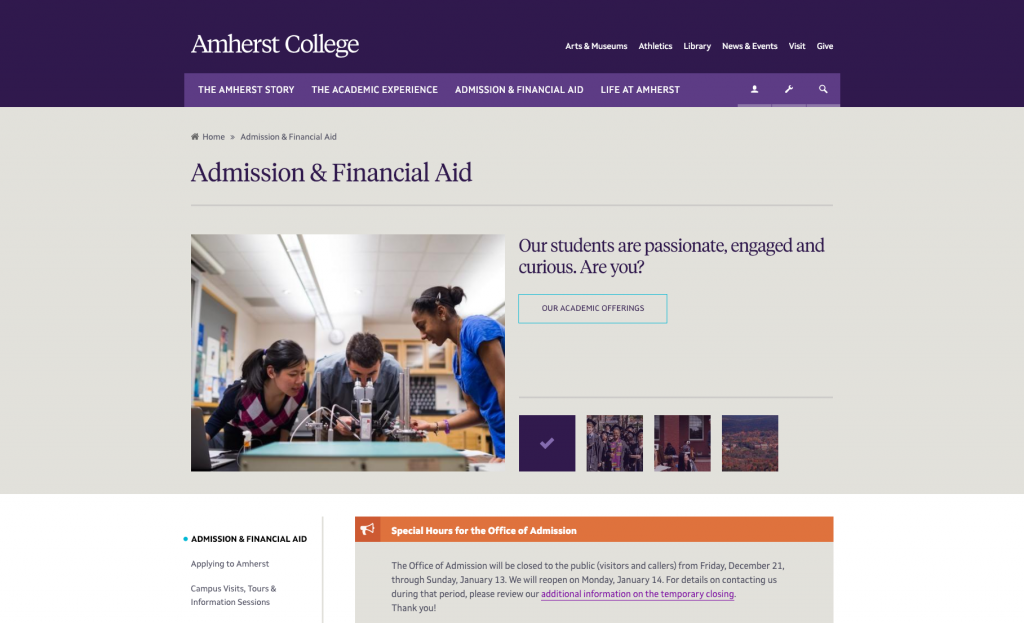
The Problem: You’re Prioritizing the Wrong Content
Staff members have told me that they put the information that’s important to the department or university first because they believe it will force people to engage with that content on their way to do what they actually came to do. Nothing could be further from what people want or how they actually behave.
The first items on a page signal what’s important. They show people what the page is about. When you start with the content you want users to look at, you’re saying two things to them:
- This page is irrelevant to you.
- We don’t care about what’s important to you; here’s our stuff instead.
People get frustrated or confused when irrelevant content is in their way. Many users will leave pages without taking action, either because they believe they can complete their task faster another way or because they don’t realize what they want is even on the page.
This is bad news for your online engagement and for staff members who field the phone calls and questions from university customers who are just trying to get simple things done.
Do This Instead
Make what your visitors came to do (their core tasks) the very first or most prominent thing on the page. It might sound counterintuitive, but giving people the ability to complete their tasks first makes it more likely that they’ll take the time to engage with your other content.
2. Writing Web Content Like an Academic Paper
Many higher education websites are written by academics, usually staff members in departments that own particular pages or sections. Academics are used to writing long, thorough, detailed papers. But for a public university website, the majority of users are students and their parents, not career academics.
The Secret: Everyone is task-oriented online.
Even hardcore academes don’t want to read a dense block of text just to find the right form to submit or pay a parking ticket. Believe me, there’s a time for heavy reading. In the middle of trying to complete an online task is not that time. Not for anyone.
Effective web writing is drastically different from effective academic writing. Online, your users need you to get to the point in as few words as possible. Unless visitors are actually reading your university blog or a digital paper, they are not on your website to read. Instead, they want to get something done. Help them out by making your content so easy to scan and digest, people can find what they’re looking for before they even have to think about it.
Creating Easy-to-Scan Content
How do you make your content easy for users to scan? Some universities think this simply means writing something more akin to marketing copy than academic prose. Not so. Here’s how to best organize actions and tasks within the content area:
- Give Directions, Not Exposition – Think of your online content as signposts and roadside directions, rather than as an essay or article.
- Prioritize User Actions – Prioritize visitors’ tasks prominently at the top of the page.
- Write Concise, Descriptive Titles – Use headings and keep supporting copy to a bare minimum to keep information at a manageable level.
- Create Brief and Clear Calls to Action – Offer descriptive, clear, short calls to action so visitors can easily understand what they need to do.
This means you must avoid:
Paragraphs
Really, no paragraphs. Higher education institutions are the biggest offender of overly verbose web pages. They say in five sentences what could have been better said in five words. Also keep in mind that online, a paragraph is more like three sentences, not five.
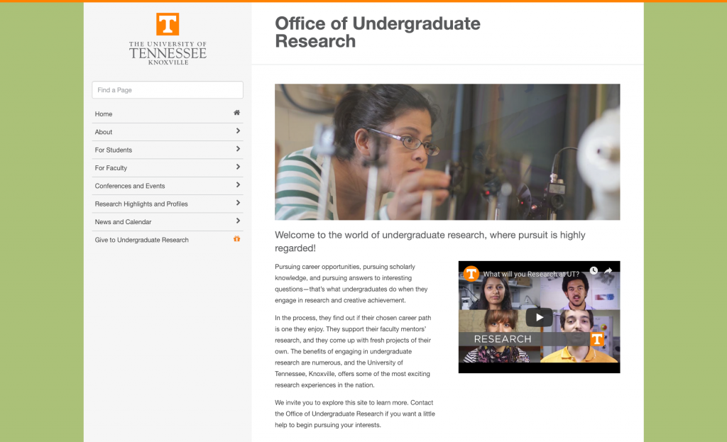
In-Line Links
If your web page contains an important action or link, you must call it out by itself with a heading or button or both. Links buried inside sentences (or in those paragraphs you’re not allowed to have) will go utterly unnoticed.
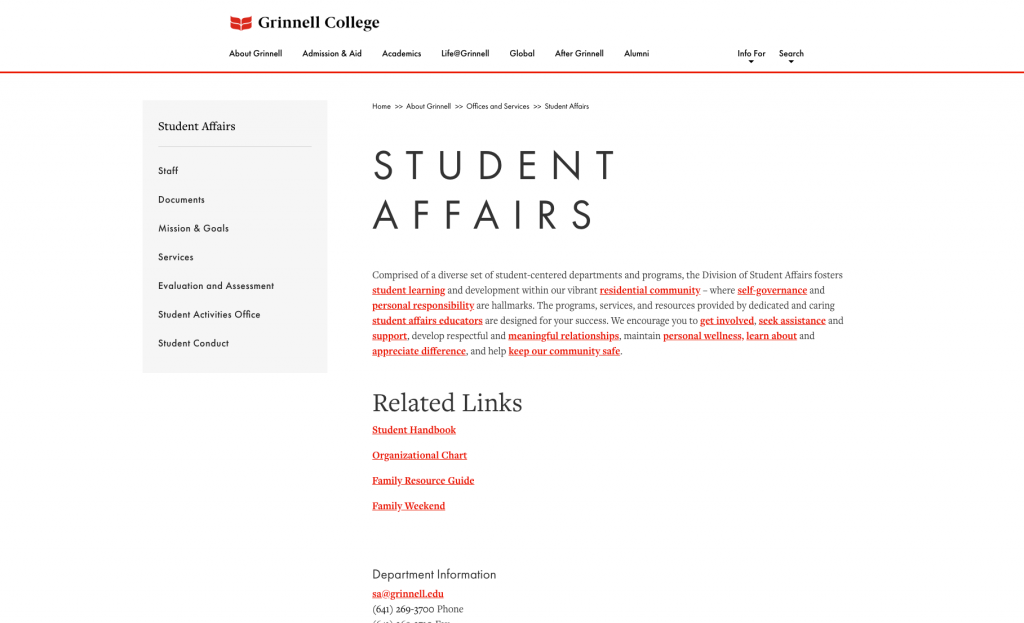
Unnecessary Copy
This usually creeps onto the page in the form of long introduction paragraphs or explanations of largely irrelevant internal concerns. Cull your copy mercilessly. If it’s not directly serving the reason someone would visit the page, it goes. Most university pages can cut their content by at least 90 percent. Really. Once you think you’ve cut enough, go back and cut another 50 percent of the words on the page. If it feels difficult, you’re doing it right.
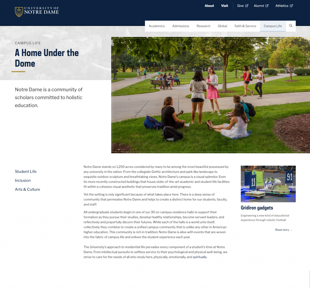
Don’t allow departments to write their own content.
Unless the department has a dedicated communications specialist who understands web copy and can devote time to writing a website, department heads and staff members are wholly unprepared to write online content.
When you give departments free reign to write their own web pages, you end up with content that reads like an academic paper and scares even the smartest, most determined users away.
3. Vague Navigation and Labels
I have yet to see a university or college website that doesn’t offer vague, nebulous navigation labels such as “Quick Links” or “Resources” (see also the list of words you should NEVER use online). These types of junk drawer names are bad enough on interior pages and sub-navigation menus, but the sad and horrible truth is that they often rear their heads in main site navigation and major links on higher education home pages.
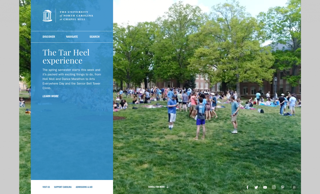
So. Much. Content.
I understand why universities and colleges resort to these vague labels. The one constant for all university websites is the sheer amount of content they contain. All this information can be overwhelming and often results in millions of pages associated with a single .edu URL. That bottomless pit of information makes it much harder to organize it all into distinct sections that make sense. General, all-encompassing titles like “Helpful Links” or “Discover” may seem like the answer to your fervent organizational prayers. They are not.
Clarity is Essential
The fact that there’s so much content and it’s so difficult to wrangle makes it all the more necessary for you to be fastidious about creating clear, well-named sections for every last bit of information. If you have trouble finding and organizing information, imagine how hard it must be for your poor users. No wonder they often give up and call or decide that whatever they were trying to find isn’t worth the trouble.
User-Friendly Content Will Make You a Better Competitor
All of these content mistakes make your higher ed website difficult to use and frustrating to navigate. A great many site visitors do one of a few things when facing dense, confusing content:
- Leave – If what they wanted to do isn’t required, they simply leave, never to return.
- Call – If they have a task they must complete, they’ll call the department to get it done rather than attempt to use the website.
- Fail – They’ll complete the task, but incorrectly because they didn’t see a required action or weren’t able to understand a crucial step.
Each causes headaches, decreases efficiency and engagement, and adds cost for the department and the university.
Here’s the great news: The vast majority of universities and colleges are making these huge, engagement-killing content mistakes. If you stop making these same content mistakes on your own site, you automatically pull ahead as an online competitor in every conceivable way. Fixing these content mistakes will absolutely be worth it for your university’s overall online engagement and your bottom line.


