Alt = “Title for a Post That Doesn’t Actually Describe It Whatsoever”
5 min read
Alternative (alt) text is the most commonly known accessibility requirement. Most people know they should write alt text for images (even if they don’t do so in practice). However, the sheer abundance of poorly written and inaccessible alt text out there suggests most of us are not aware of what it takes to write it. Most people simply don’t provide descriptions of images that will be in any way useful for people with disabilities.
Unpacking Alt Text
We’ve broken down the function of alt text and show how to write it in a way that’s actually helpful. That way, everyone can use your site and appreciate its images.
The WCAG Guideline
WCAG offers the standard for digital accessibility. Guideline 1.1 says “The purpose of this guideline is to ensure that all non-text content is also available in text.” In theory, this is quite simple. Any images that add context or information to a page must have alt text describing that information.
- Perceivable Principle – This guideline falls under WCAG’s principle that online content and interactions must be “perceivable.”
What this Means for Users with Disabilities
People using screen readers to help them navigate your interface will literally hear the alt text you’ve written to explain images. Without this alt text, there is no way for blind and low-vision users to access the information found in the image. Screen readers are not use only by those with vision-related disabilities. They are also sometimes used by people with learning disabilities to help them receive information through multiple senses.
Best Practices
Know when to use alt text.
Images require alternative (alt) text if they:
- Convey information that isn’t available elsewhere in the text on the screen.
- Help the user understand the content.
- Contain an action (e.g. you click on the image and something happens).
- Contain text that can’t be found on the page.
If an image doesn’t do any of the above, then it is considered decorative, and the alt text should be left blank.
Describe the spirit and context of the image.
Helpful alt text conveys the same information in words that the image is conveying visually. Ask yourself:
- What is important about the image?
- What information is the image adding to the page?
- How would you relay that information to someone who couldn’t see it?
Include any text that is part of the image.
Screen readers cannot see text that is embedded inside of an image. Therefore, helpful alt text should repeat whatever text is in the image. (Better yet, you could take the text out of the image and present it as live text on the page.)
Describe any action related to the image not already described in surrounding words.
If the image is being used for an action (the user clicks on the image and something happens) and there are no accompanying words on the page to describe the action, helpful alt text will present the action that will occur if the user clicks the image.
Avoid using “Photo of” or “Image of” in alt text.
Screen readers already tell users when something is an image, so including that information in the alt text will be redundant and obnoxious for users.
Be as succinct as you can.
Convey the meaning of the visual in as few characters as possible, while still communicating the full intent of the image. Users with screen readers have to listen to every word you write, so anything extra can cause annoyance and frustration.
If an image doesn’t offer additional information not found in words on the page, leave it blank.
If your image truly doesn’t present any information that can’t be gathered another way, you can leave the alt text blank so the screen reader will skip the image entirely.
Example: Dogs and Oil Rigs
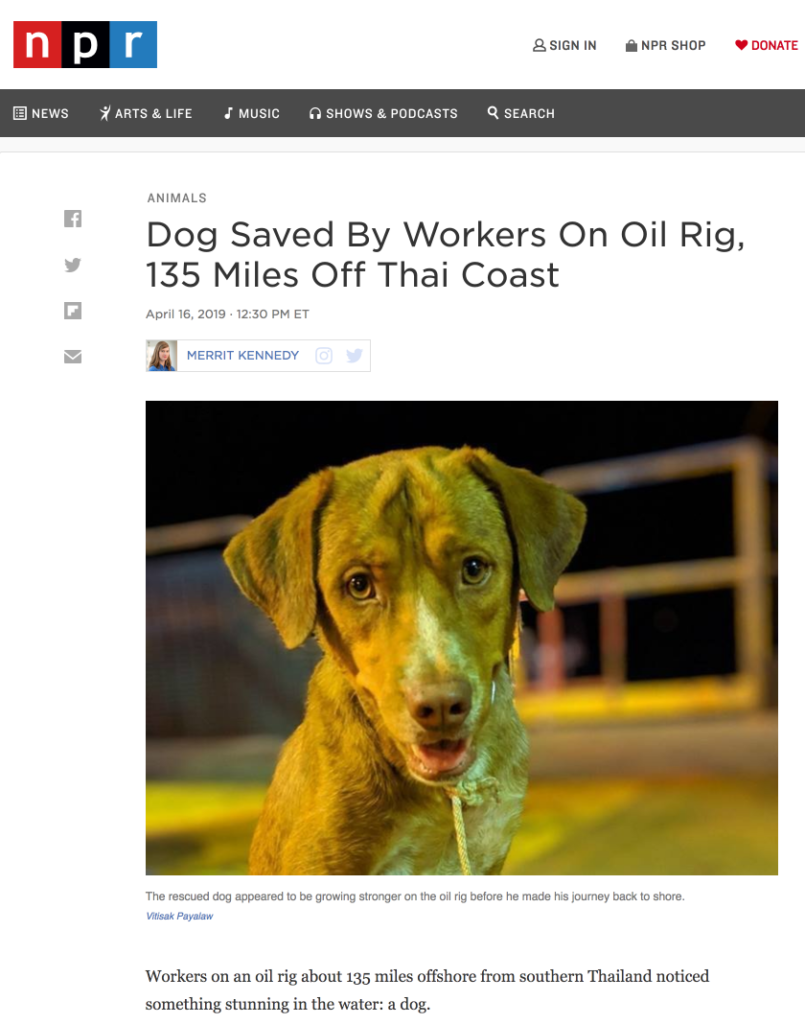
A recent story from NPR included photos of a dog rescued at sea by oil rig workers. This is an interesting case study of how to decide whether you need alt text and, if you do, what that alt text should describe.

Captions and Alt Text
The photo above present visual information not mentioned in the rest of the article. However, this photo, and others in the story have captions, like the one above, that explicitly describe what is happening in the photo. For that reason, alt text for these photos could reasonably be left blank.
If the captions were removed or if they left out important information found in the photo, these images would need alt text.
Helpful Alt Text – “Happy-looking, clean dog on the deck of an oil rig wearing a homemade braided rope leash.”
Unhelpful Alt Text – “Photo of dog”
A Picture is Worth a Thousand Words
Or really just enough to adequately describe what is going on in the image. So, throw out any “Photo of a person smiling” alt text and replace it with truly descriptive language. Your digital product’s accessibility and its users with disabilities will thank you.
Part of the Accessibility for Developers Whitepaper
You can download the full whitepaper from the Progress site.
All Posts in This Series
- PDFs: The Most Difficult, Most Widespread Digital Accessibility Problem
- Forms Don’t Have to Be Fun but They Do Have to Be Accessible
- People With Disabilities Like TV and Podcasts, Too
- The Accessibility Requirement You’re Probably Failing Right Now: Focus States
- Your Color Choice Could Be Keeping Your Site or App from Digital Accessibility
- Creating Navigable Page Structures: An Accessibility Building Block
- Alt = “Title for a Post That Doesn’t Actually Describe It Whatsoever”


