Forms Don’t Have To Be Fun But They Do Have To Be Accessible
4 min read
We all know how important digital forms can be in everyday life. Most of us use them without even thinking about it to complete critical tasks like applying for jobs, paying bills, and managing our ever-growing number of online accounts. Imagine if every time you went to do one of those crucial tasks, you were faced with hours of effort just to figure out how to complete the form. That’s very often the reality that people with disabilities live in.
Make Forms Hassle-Free
Digital forms are often a huge challenge for users with disabilities. If no thought has been given to accessibility, even the easiest form can turn into a big problem. In fact, horribly inaccessible forms can be literally impossible for users with disabilities to complete.
To make accessible forms that those with disabilities can actually use, you must follow WCAG accessibility compliance guidelines, which basically means:
- All fields must be clearly labeled.
- Success and error messages must be obvious.
- All fields need to work with a keyboard.
The WCAG Guidelines
- Guiding Principle – Guidelines for forms fall under every one of WCAG’s principles for online content: “perceivable,” “operable,” “understandable” and “robust.”
Provide Labels
Guideline 3.3.2 requires that “labels or instructions are provided when content requires user input.”
Determine Name and Role
Guideline 4.1.2 says that, for all components, “the name and role can be programmatically determined.”
Identify and Describe Errors
Guideline 3.3.1 says, “If an input error is automatically detected, the item that is in error is identified and the error is described to the user in text.”
What This Means for Users with Disabilities
People who use a keyboard to navigate forms rely on being able to get to fields in an organized, sensical manner. They also need to be able to see clearly which field or component they’re about to fill out. These users rely on programmatically set form labels to provide instructions and help them understand a component’s purpose.
Users who are blind or have low vision also cannot use visual-only cues for errors and success messages. Visual indicators that mark required or incorrectly entered fields don’t mean anything to someone who can’t see them.
Likewise, success messages that appear and can be read by a screen reader after a form has been submitted are important, so users don’t attempt to submit the form again. Submitting a form multiple times can be really problematic if you’re, say, paying your credit card bill or applying for a loan.
Best Practices
1. Label controls, then group them.
All form controls must be labeled, and related controls must be grouped. Grouping related controls in a FIELDSET with a legend makes forms much easier to understand and fill out. Similarly, putting a label before a control makes it much easier for users to associate the two.
2. Notify users about the results of their form submission.
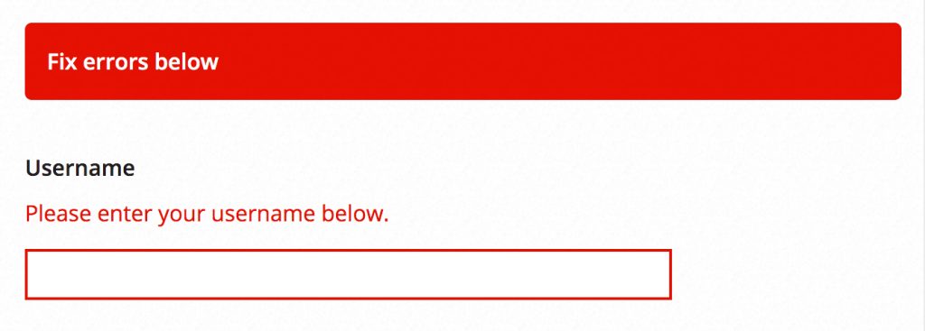
You must notify users clearly of the result of their form submission, whether it was successfully submitted or if there are errors they need to correct. Ideally, keyboard focus should immediately be given to a global error or success message at the top of the form after the user submits it. This will help users quickly understand what they need to do next.

3. Use control states.
Never rely on visual cues alone to inform the user of errors or that a field is required. These won’t work for users who are blind or have low vision. Instead, use the “required” attribute on controls that need it and convey errors in text that is easy to find on the page.

Don’t Make Forms More Painful Than They Need to Be
Having to fill out a form is already often one of the most frustrating, time-consuming tasks anyone can encounter online. For those with disabilities, the frustration and time spent can be exponentially worse. But you can keep that from happening by building for accessibility – you’ll make the world of digital forms a little better each time you do.
Next Post in This Series
People With Disabilities Like TV and Podcasts, Too
Part of the Accessibility for Developers Whitepaper
You can download the full whitepaper from the Progress site.
All Posts in This Series
- PDFs: The Most Difficult, Most Widespread Digital Accessibility Problem
- Forms Don’t Have to Be Fun but They Do Have to Be Accessible
- People With Disabilities Like TV and Podcasts, Too
- The Accessibility Requirement You’re Probably Failing Right Now: Focus States
- Your Color Choice Could Be Keeping Your Site or App from Digital Accessibility
- Creating Navigable Page Structures: An Accessibility Building Block
- Alt = “Title for a Post That Doesn’t Actually Describe It Whatsoever”


